
Project - Company Re-brand + Brand Photography
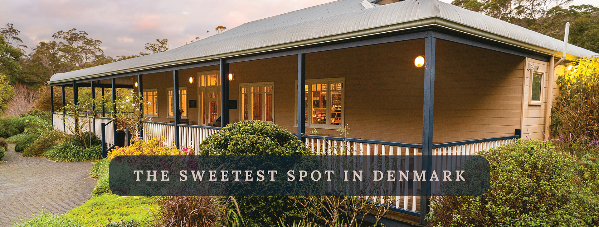
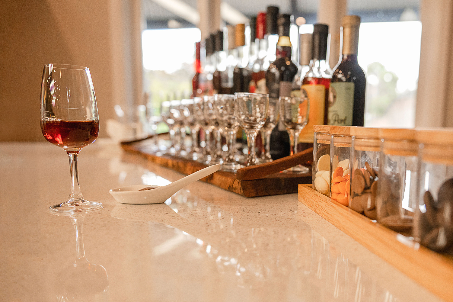
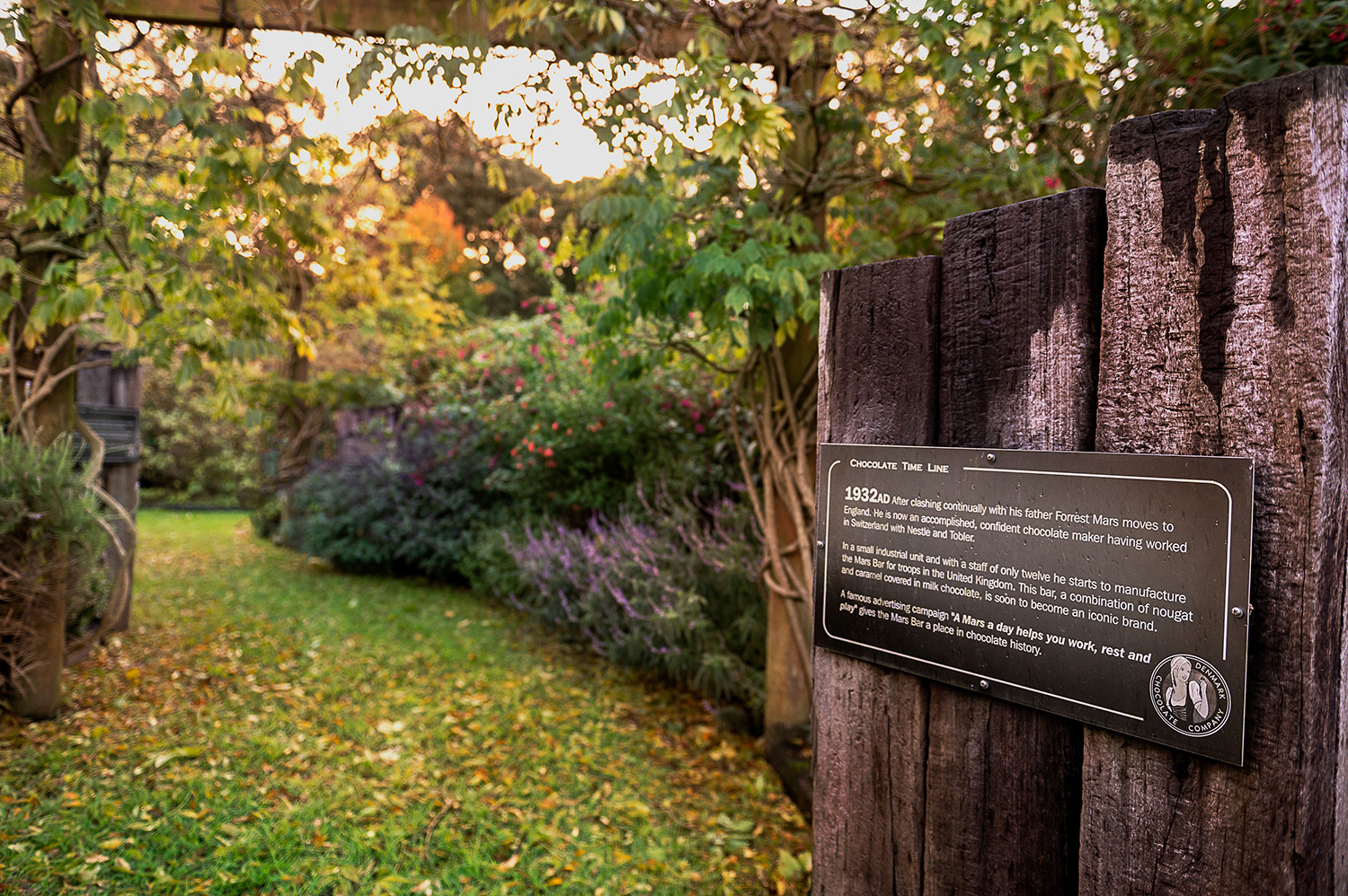
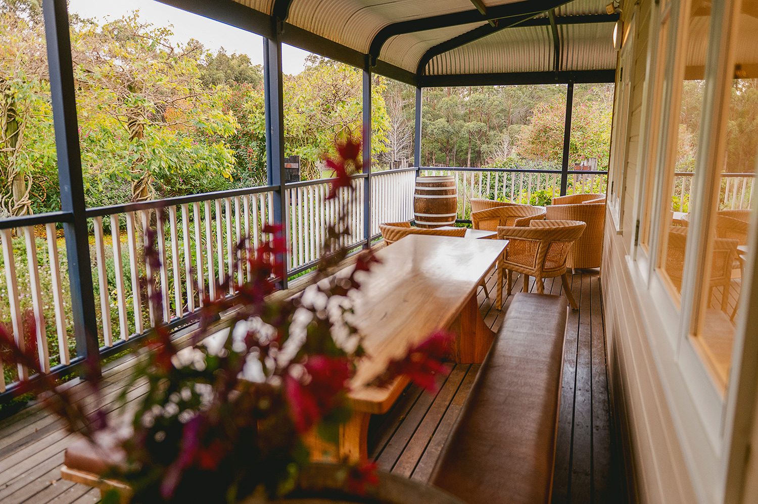
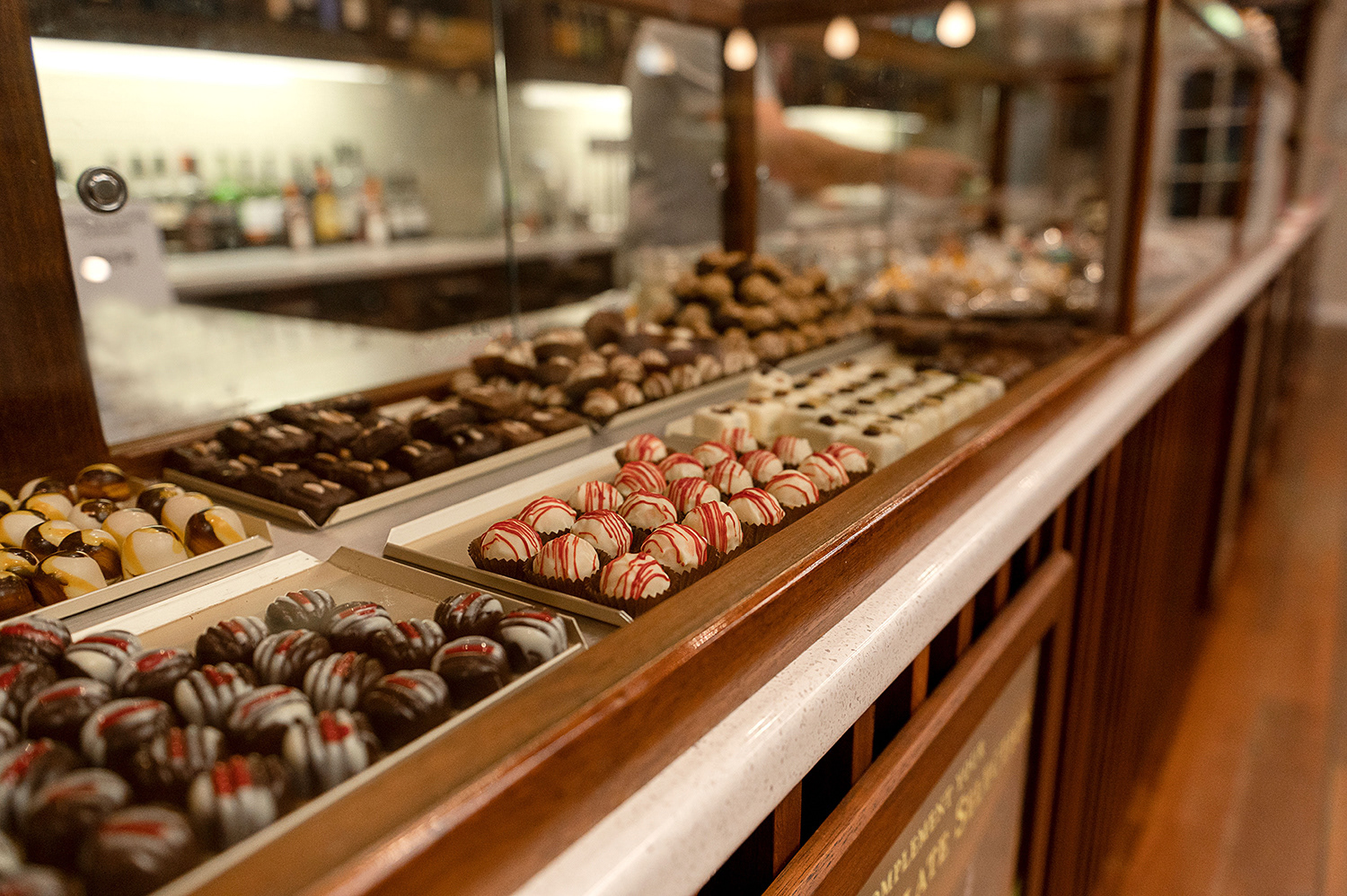
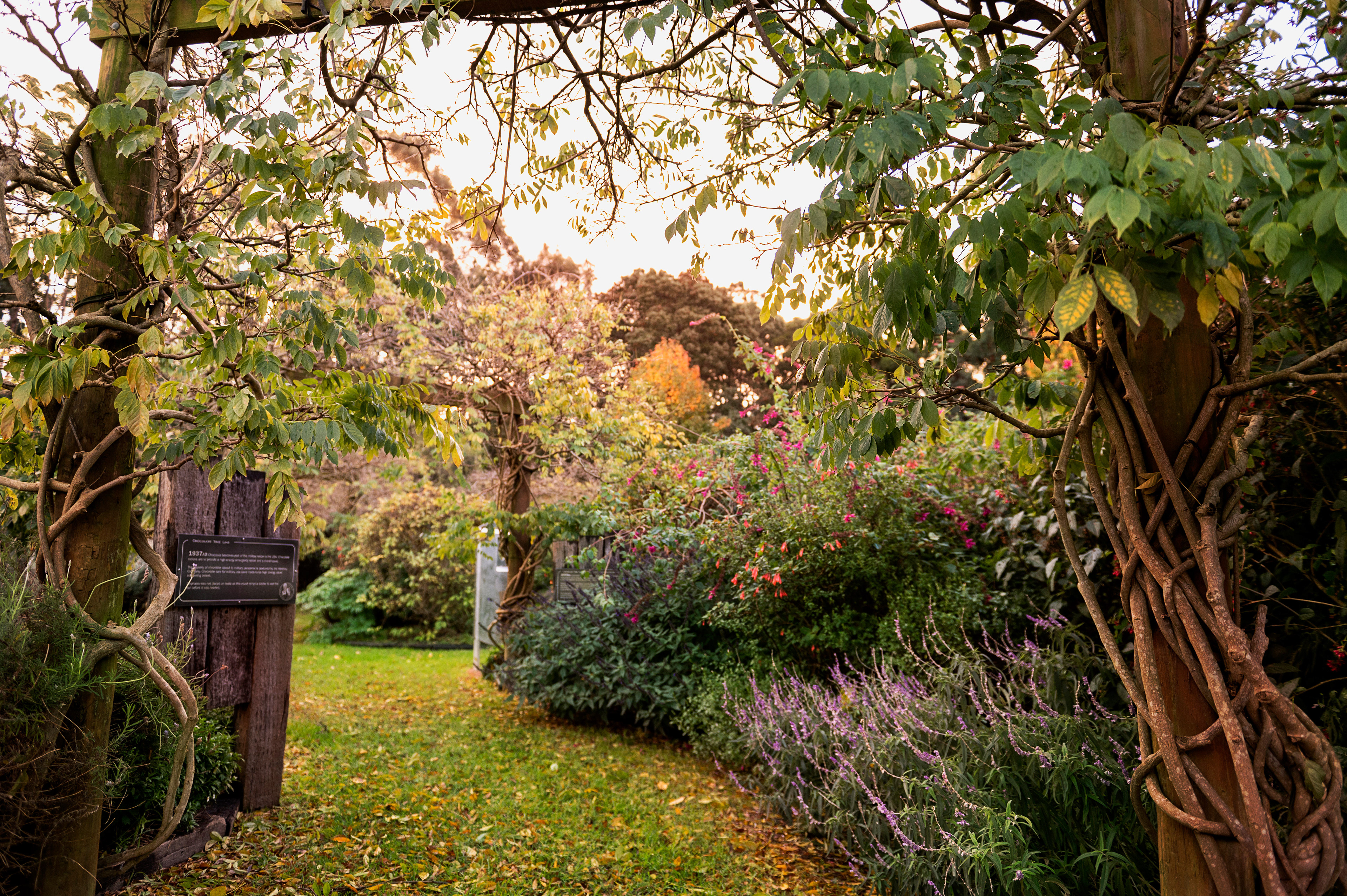
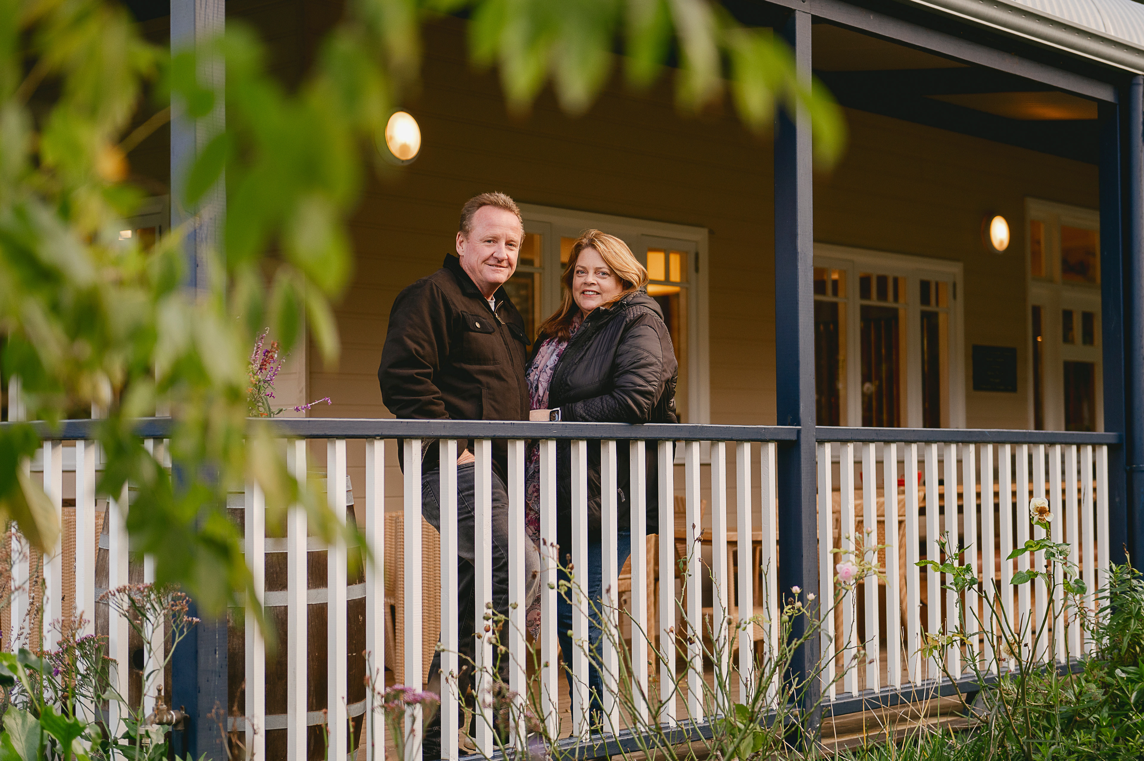
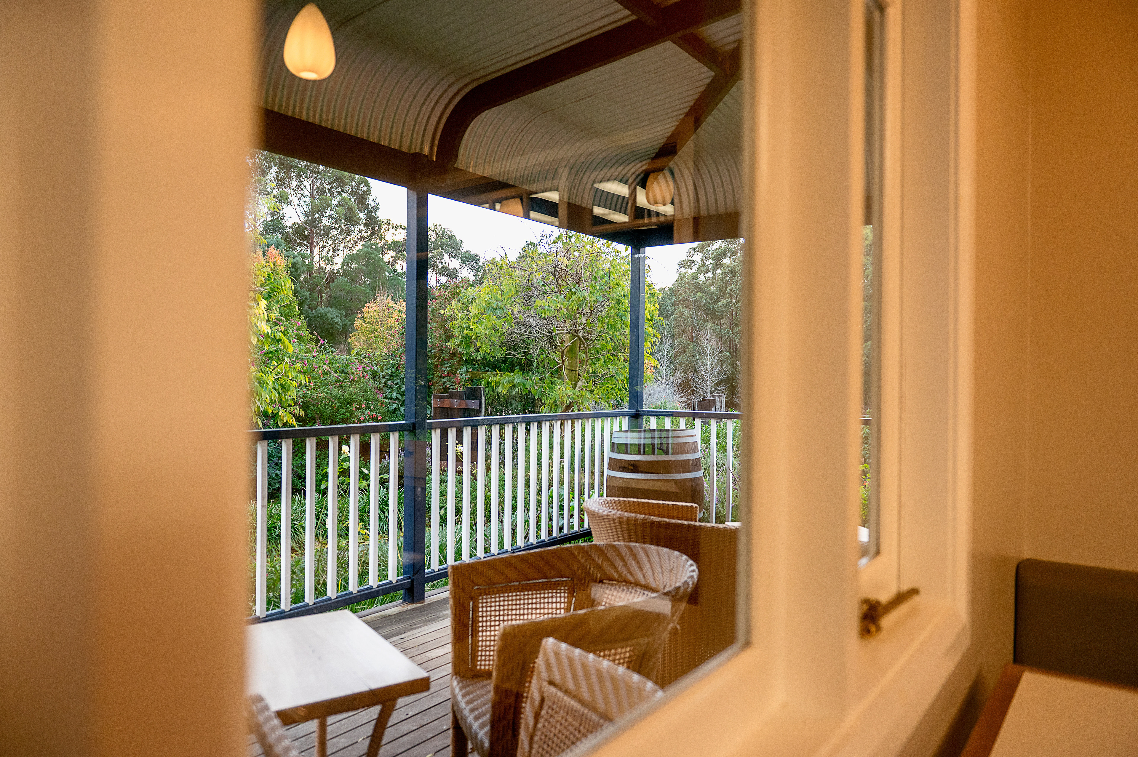
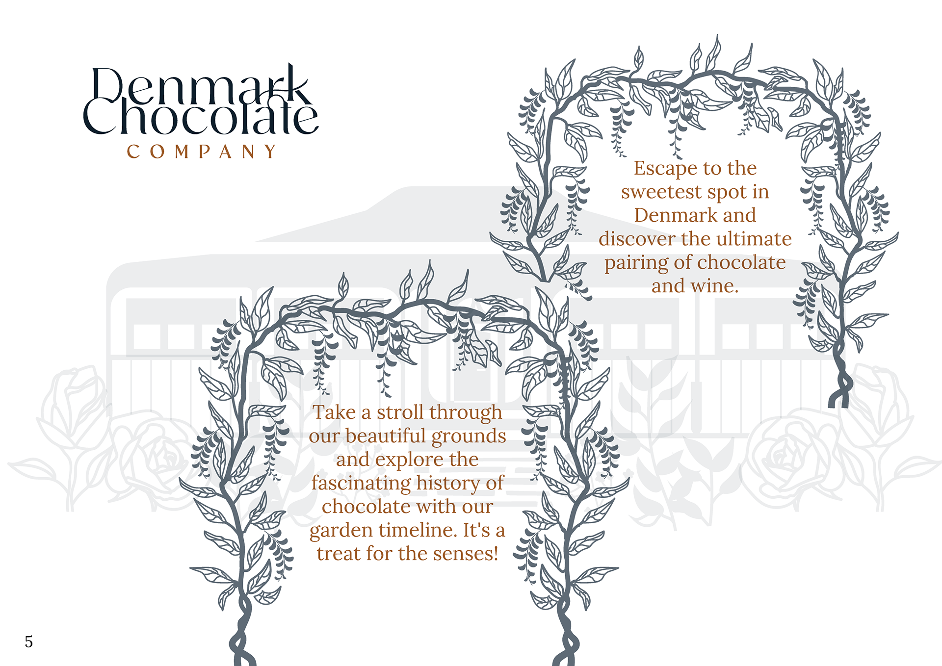
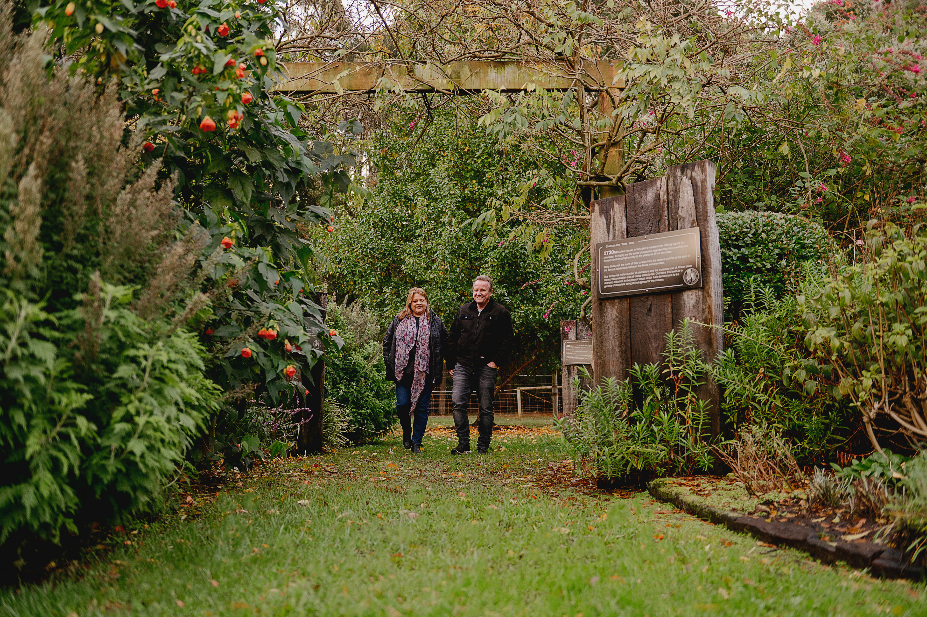
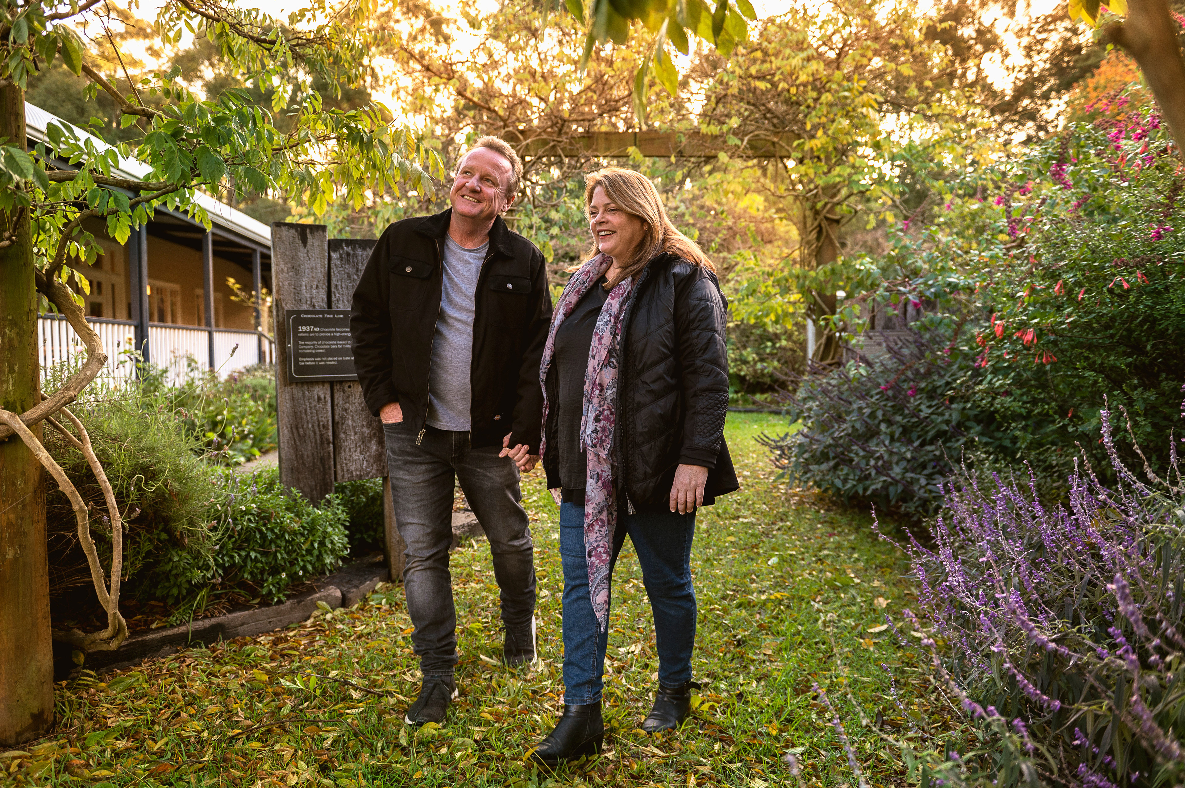
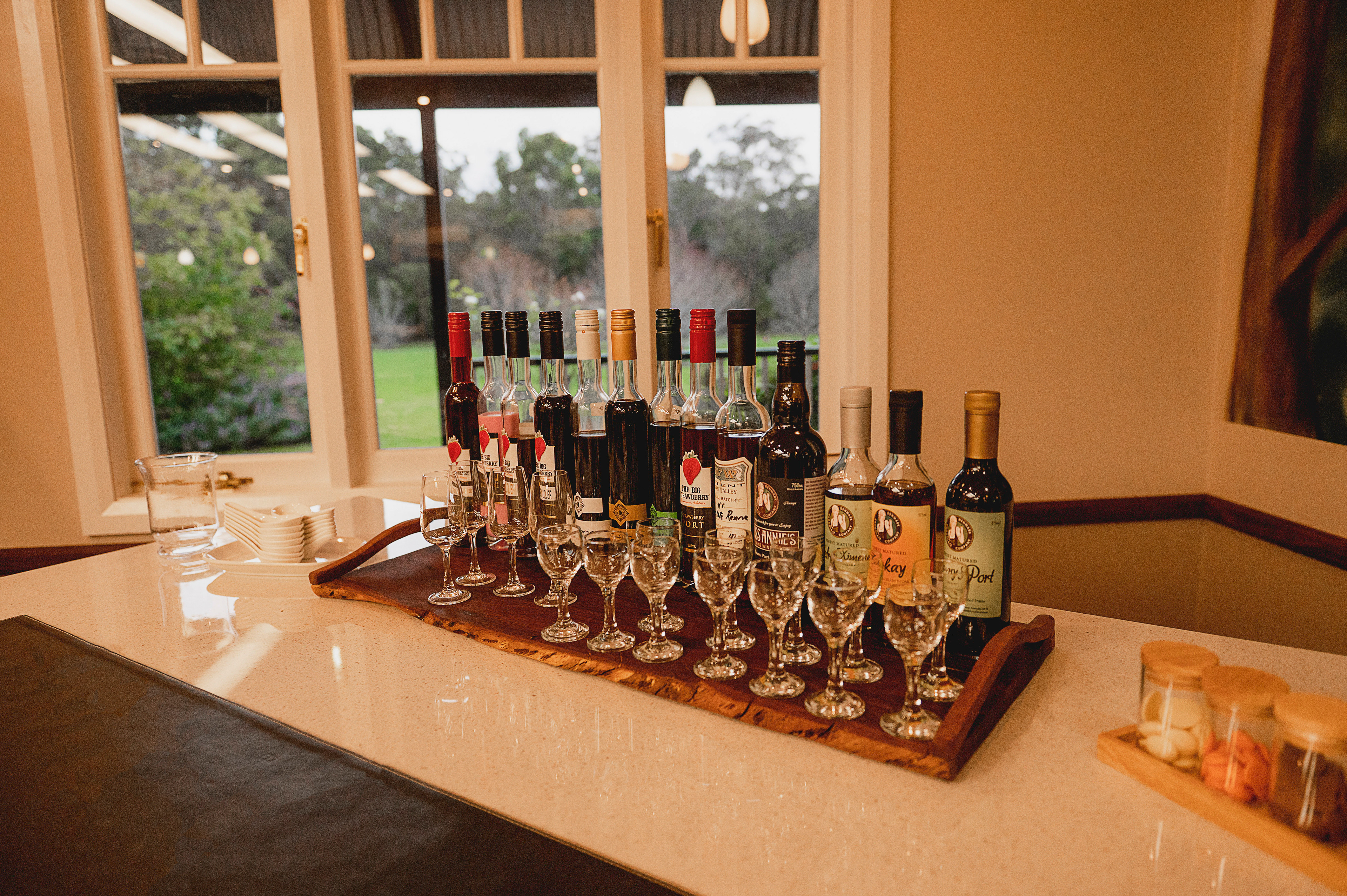
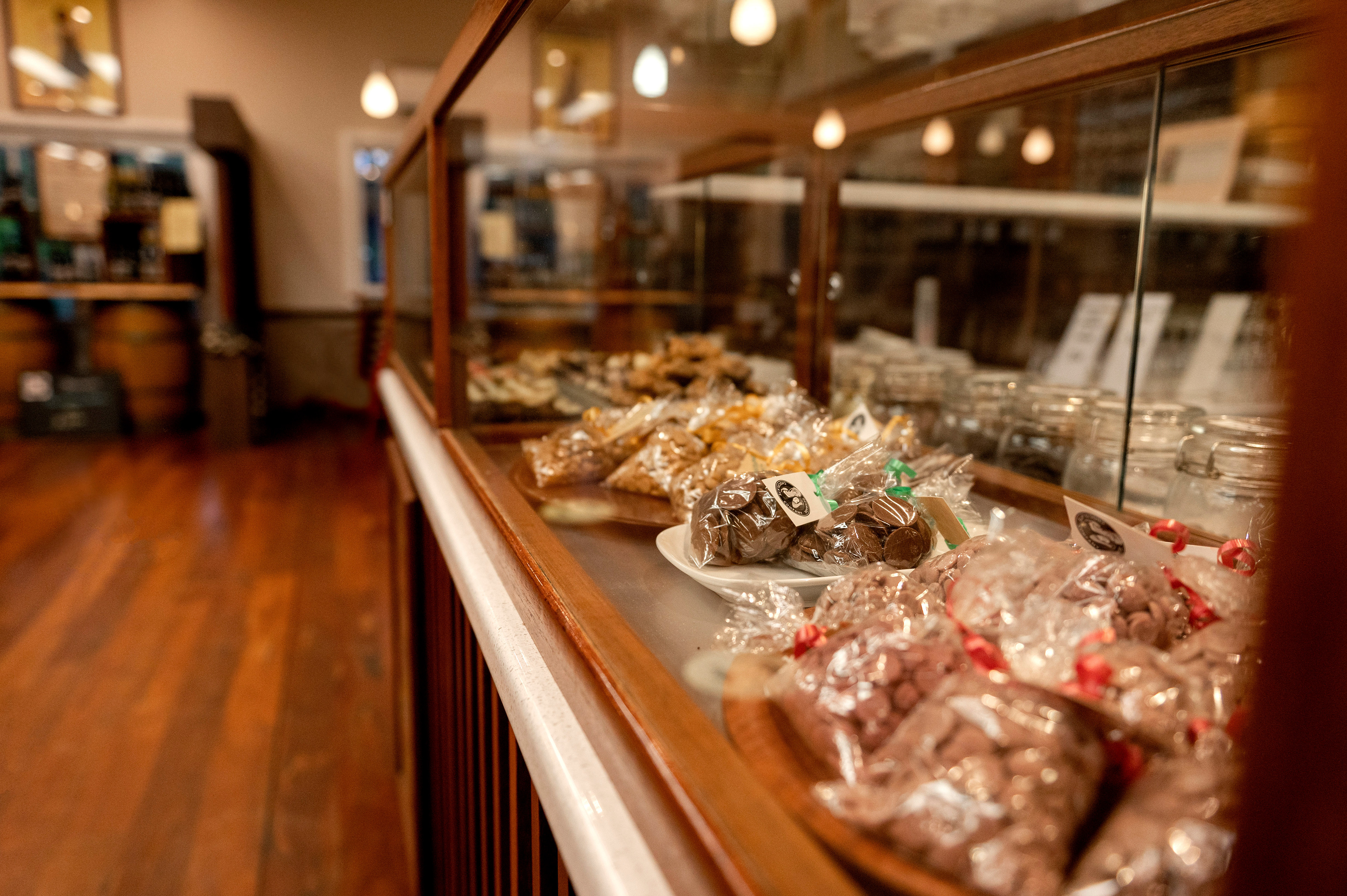
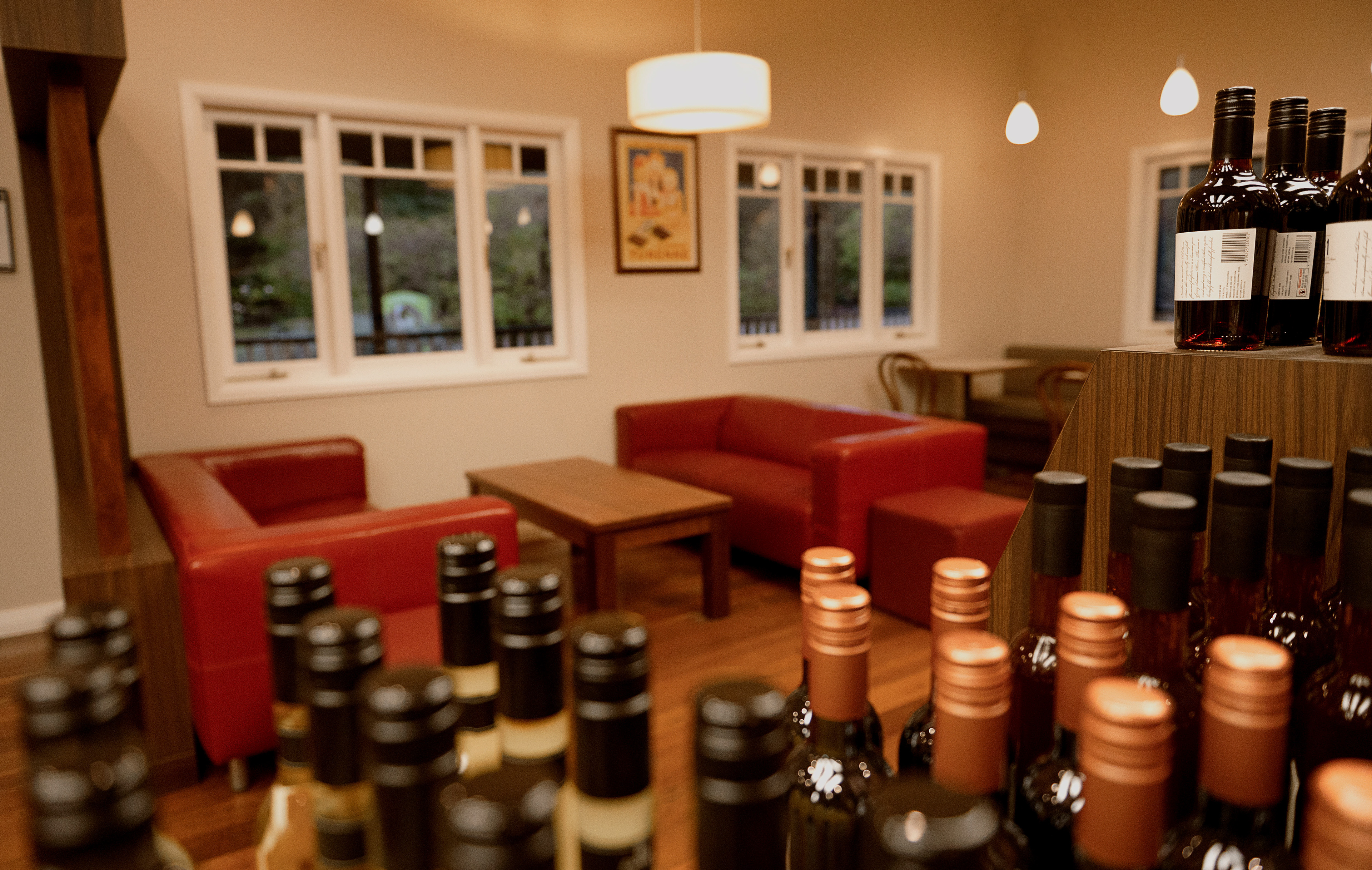
Welcome to Denmark Chocolate Company, where we invite you on a journey of indulgence and discovery. Our chocolate company is situated in the South West of Australia, surrounded by the beauty of the red tingle tree forest and set amongst enchanting gardens. As you step inside, you'll be greeted by the sweet aroma of handcrafted couverture chocolate, made with the finest ingredients and a passion for perfection. Explore our chocolate lounge, where you can sample our liqueur and chocolate pairing, expertly crafted to tantalise your taste buds. Take a moment to relax and soak up the serene surroundings, with stunning gardens and a wrap-around veranda providing the perfect setting for your chocolate experience. Discover a world of magic and warmth, with every bite of our delicious chocolates transporting you to a place of pure bliss. So come and join us on this sweet adventure, and let us take you on a journey you'll never forget.

Colour Palette
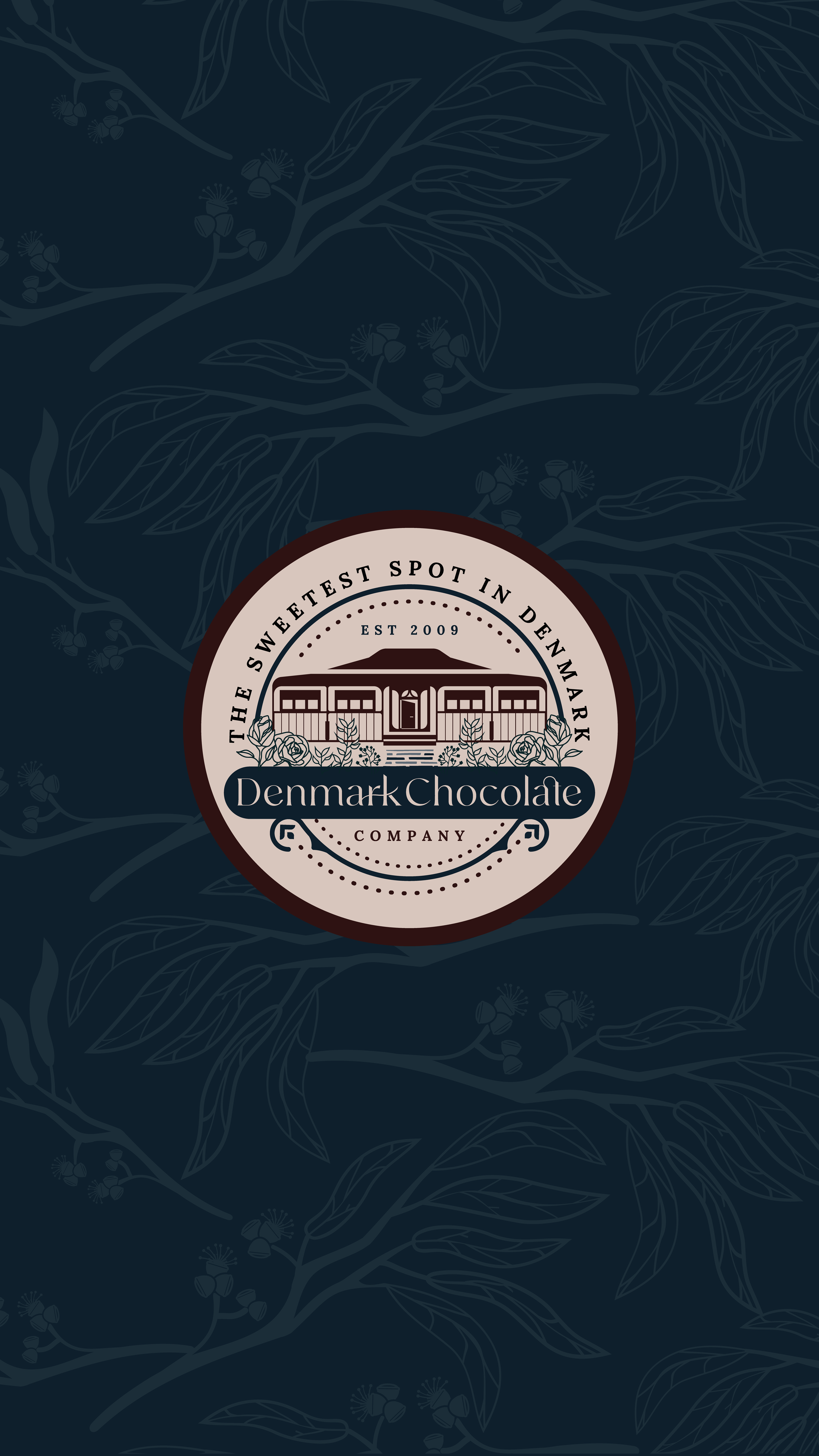
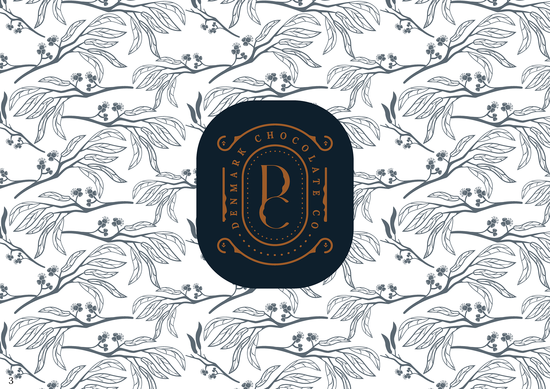
The colour palette was chosen for several reasons, all of which tie back to the brand's identity and values. Firstly, the deep winter forest blue was chosen to connect back to the setting of the red tingle forest in the south west. This colour represents the natural beauty and lushness of the forest, which is a key aspect of the brand's identity. Secondly, the orange gold colour was chosen to represent luxury and sophistication. This colour is often associated with high-end brands and products, and it conveys a sense of warmth, richness and elegance. This colour is also complementary to the deep forest blue, creating a harmonious and balanced colour palette. Thirdly, the dust pink colour was chosen as a contrast colour and to bring a point of interest into the brand. This colour represents the flora in the gardens, which is another key aspect of the brand's identity. This colour also adds a touch of femininity and softness to the colour palette, creating a well-rounded and balanced look. Finally, the chocolate earth brown colour was chosen to complement the chocolates and to give that earthy tone. This colour adds a sense of a warm and inviting feel. Just like chocolate, this colour also adds depth and richness to the colour palette.

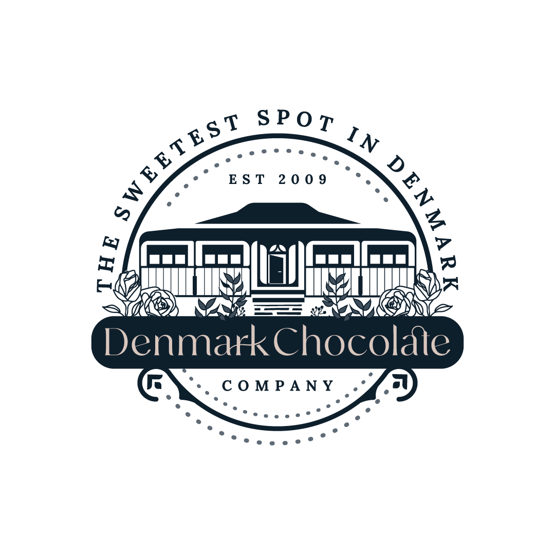
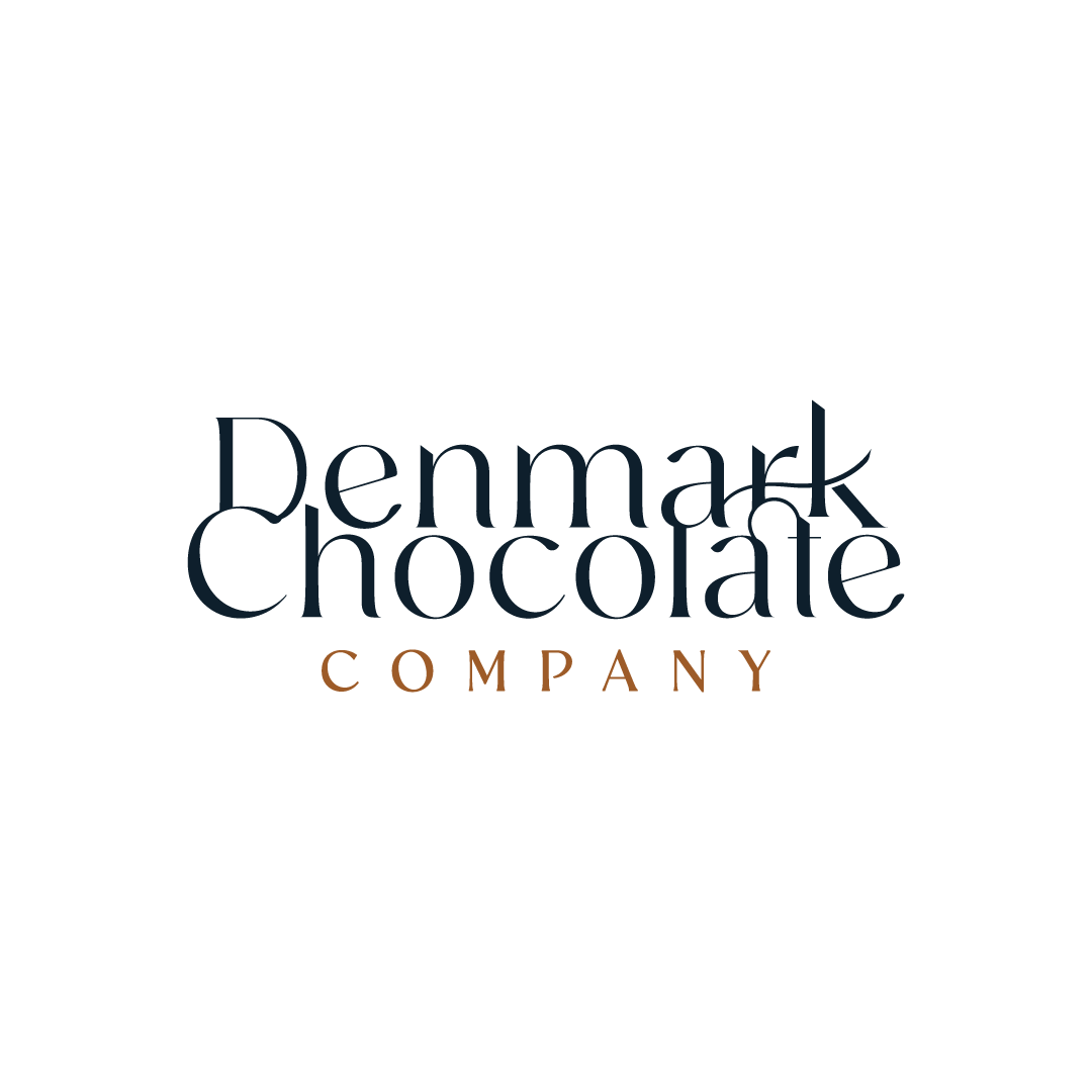
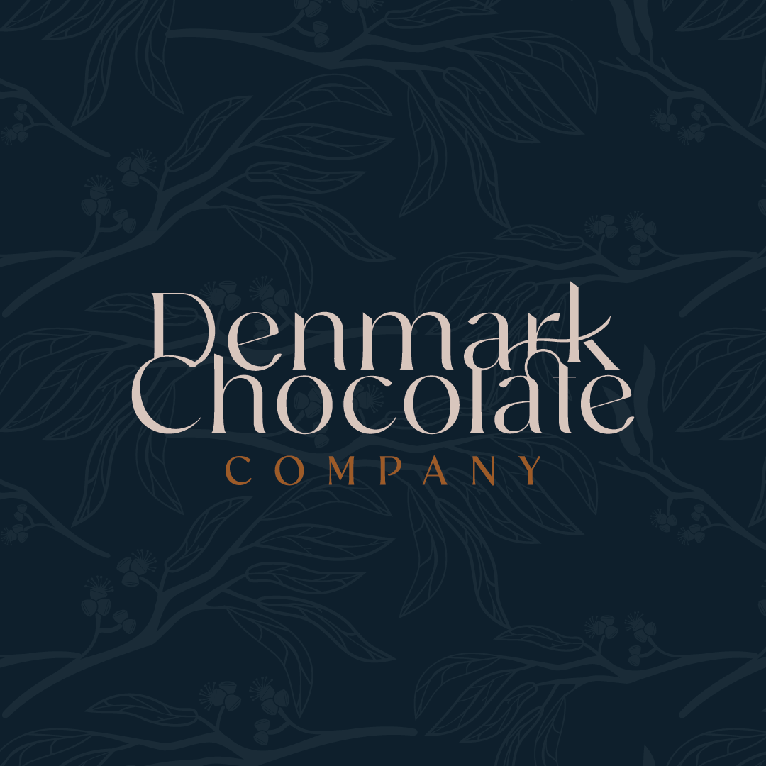
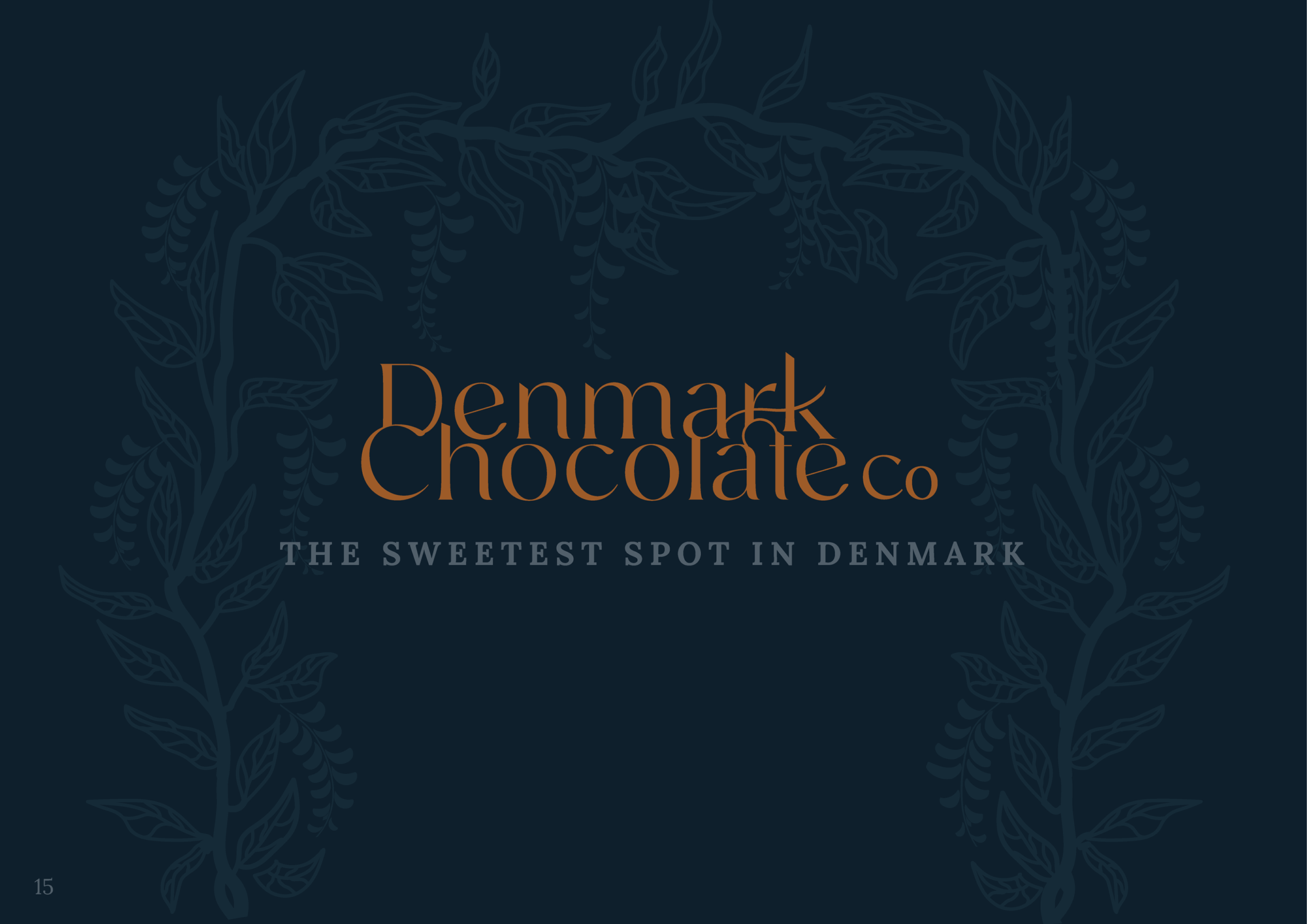
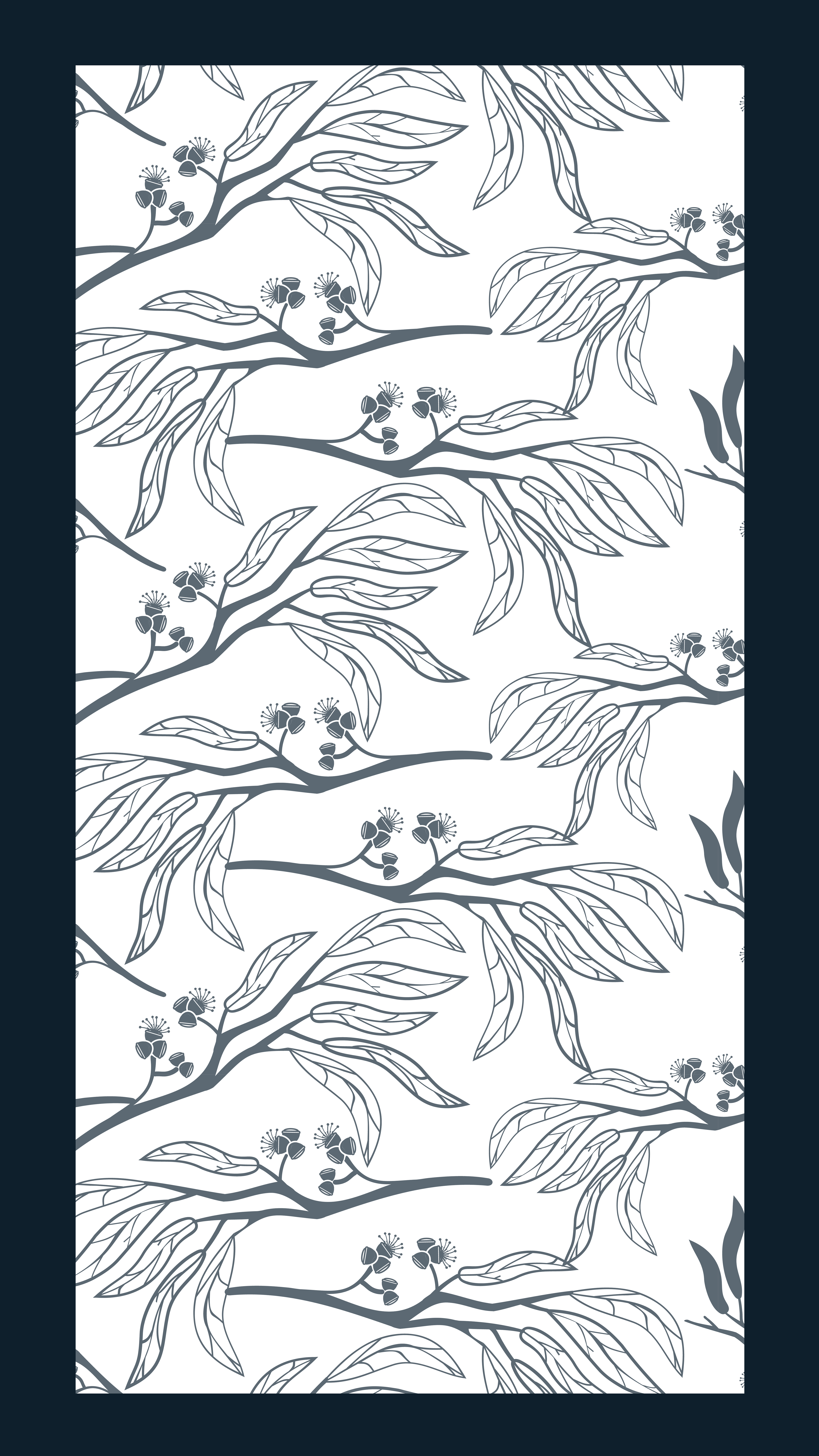
Overall, this design is nothing short of enchanting, exuding strength and responsiveness that elevates it beyond mere aesthetics. Every element has been hand drawn, contributing to an overall sense of wonder and awe. This strategic design isn't just about visual appeal; it is crafted with the intention of creating memorable experiences that linger in the minds of those who encounter it. Its ability to captivate and leave a lasting impression is a testament to the thoughtful and intentional approach taken in its creation, making it a standout and truly memorable piece of design.