Project - Company Branding
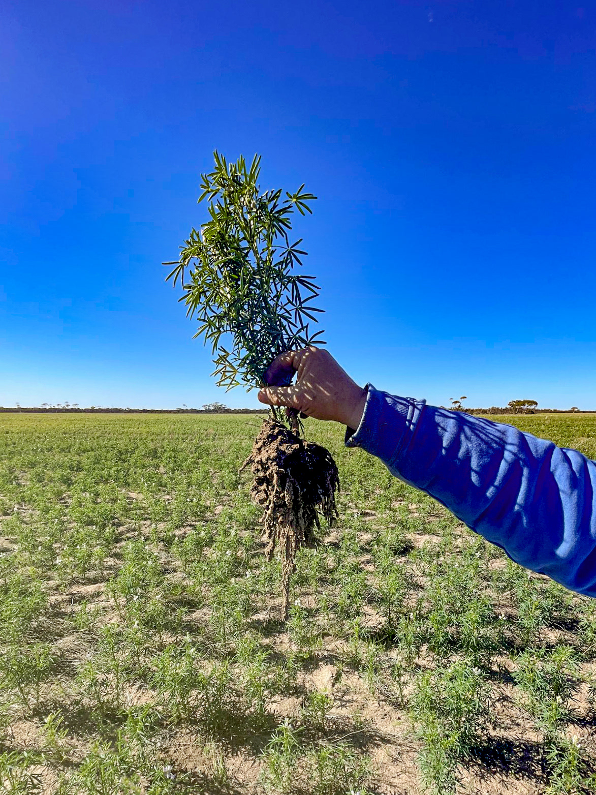
Natural Intelligence Farming harnesses the dynamic, natural relationships that exist between all organisms in ecosystems, particularly the soil. These relationships are highly complex and versatile. They involve mutually beneficial interactions between soil, plant seed and roots, microorganisms, and the ruminants that feed on the plants, cycling nutrients and microbes back to the soil. The key to Natural Intelligence Farming is that land stewards support, respect and appreciate these interactions and the powerful outcomes they create.
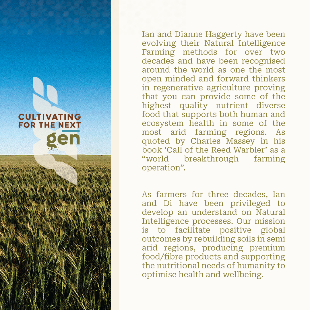
Ian and Dianne Haggerty have been evolving their Natural Intelligence Farming methods for over two decades and have been recognised around the world as one the most open minded and forward thinkers in regenerative agriculture proving that you can provide some of the highest quality nutrient diverse food that supports both human and ecosystem health in some of the most arid farming regions. As quoted by Charles Massey in his book ‘Call of the Reed Warbler’ as a “world breakthrough farming operation”. As farmers for three decades, Ian and Di have been privileged to develop an understand on Natural Intelligence processes. Our mission is to facilitate positive global outcomes by rebuilding soils in semi arid regions, producing premium food/fibre products and supporting the nutritional needs of humanity to optimise health and wellbeing.

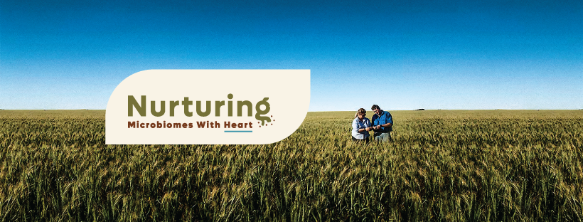
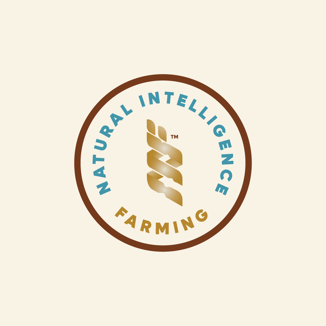
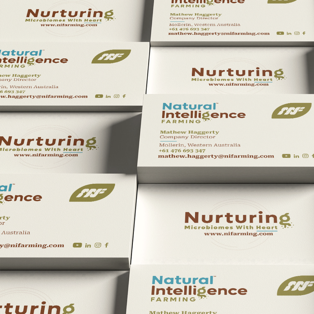
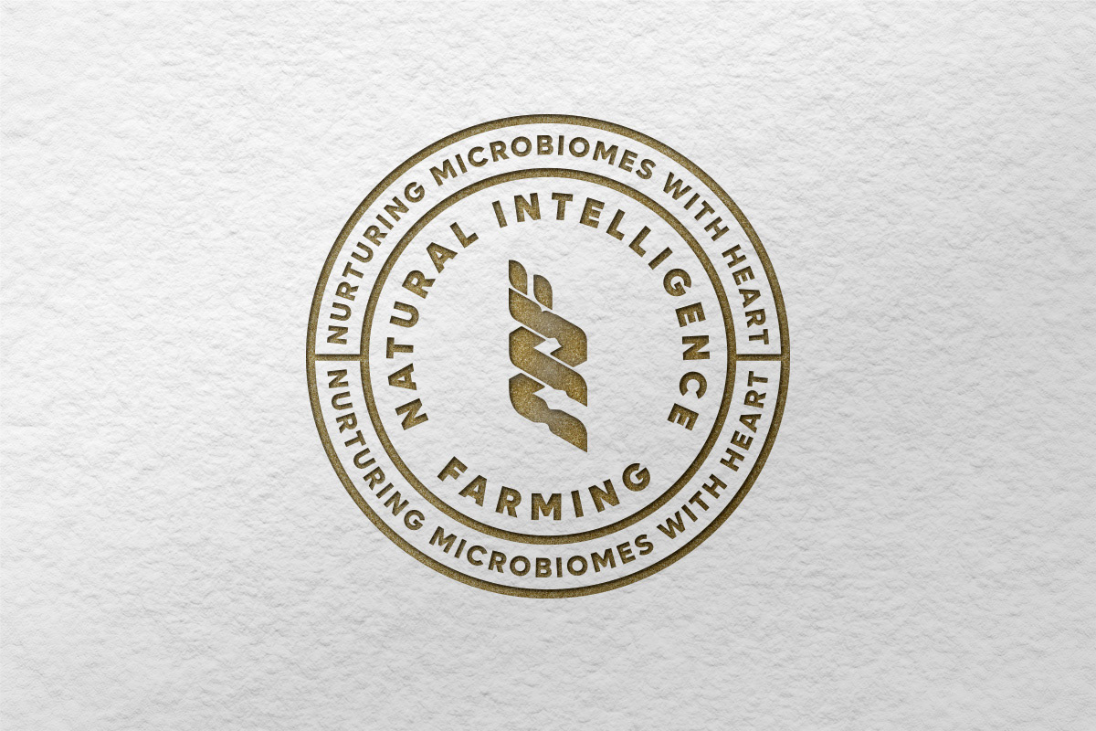
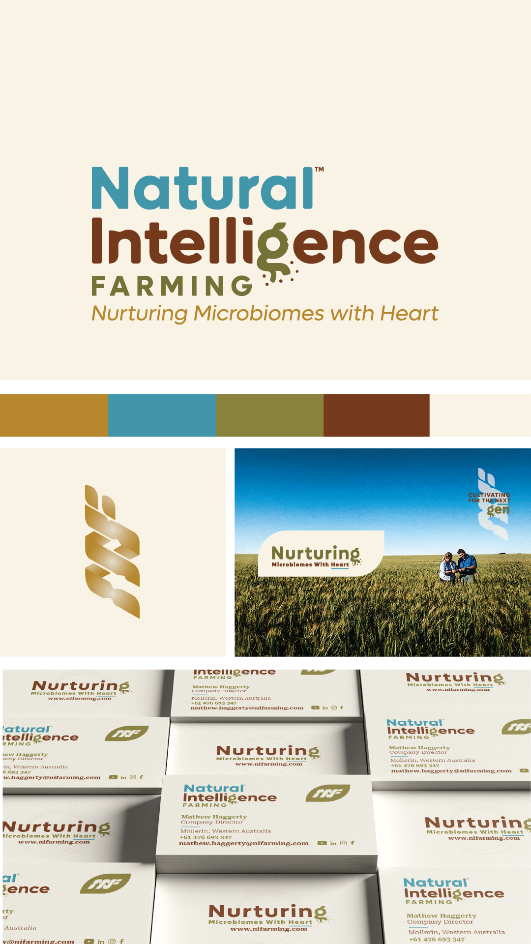
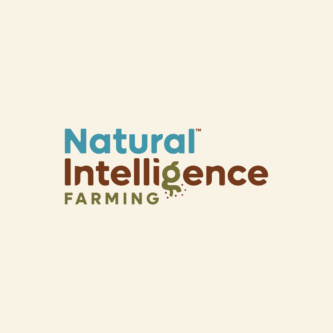
Regarding this logo, it embodies a blend of conservatism and contemporaneity in its wordmark style. Employing a licensed sans-serif font that exudes elegance, I have customised the letter "g" to become the focal point. This subtle alteration serves as a metaphor, signifying how harnessing nature's wisdom leads to enduring and sustainable outcomes. The logo ingeniously communicates that natural intelligence revolves around soil vitality and growth, ensuring its timeless relevance. The delicate dots encircling the root of the "g" form an allusion to microbiomes, a topic pivotal in discussions surrounding regenerative success in ecosystems. This element underscores the education and awareness aspect of the brand's message. One of the logo's notable attributes is its adaptability. The "g" can be extracted and seamlessly integrated into other keywords, a versatility that will be further demonstrated in the upcoming sections of this presentation.
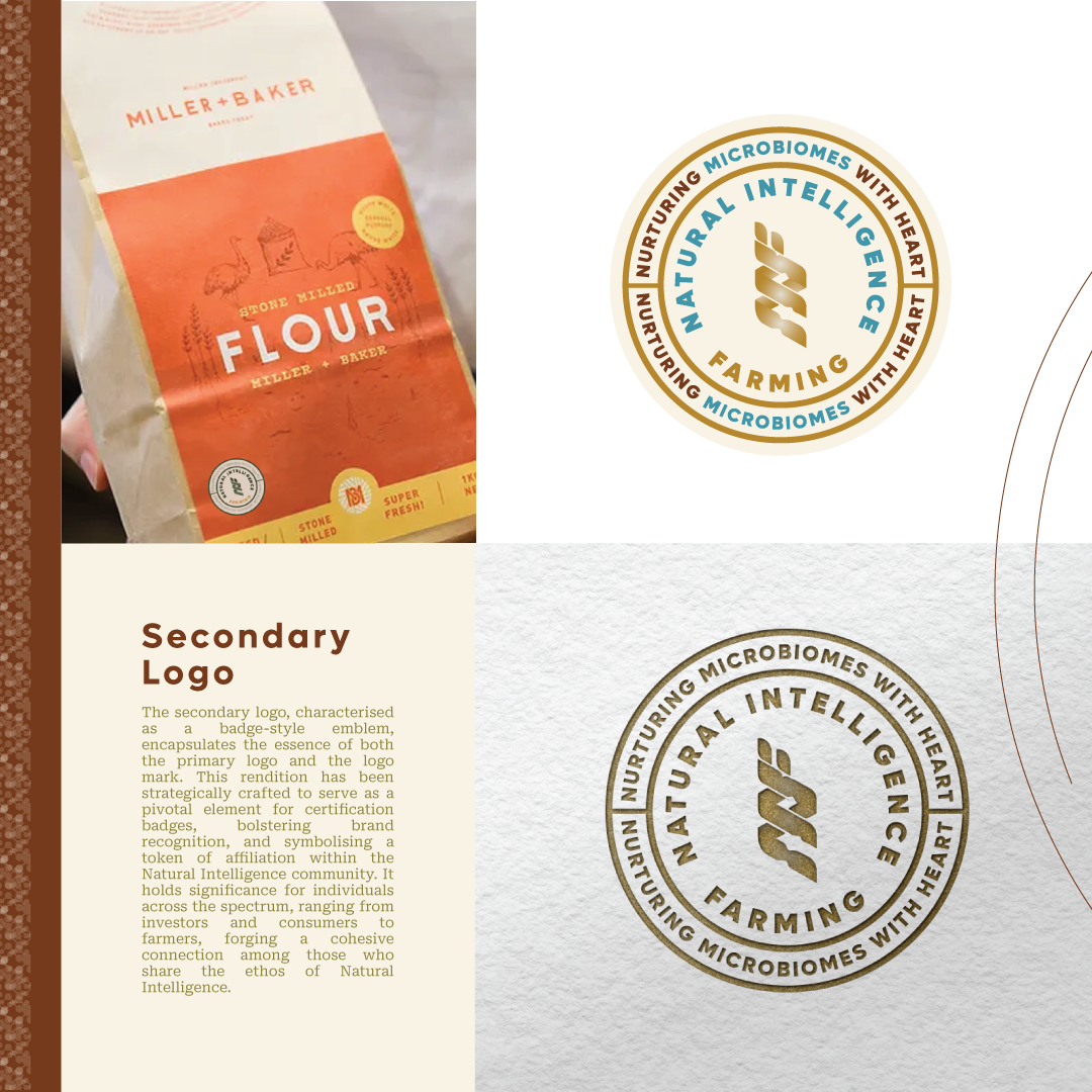
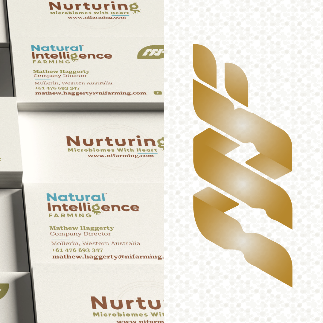
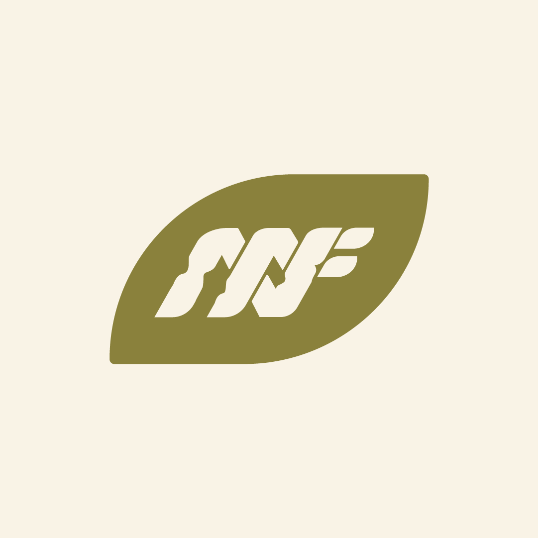

The use of the epigenetic spiral as a foundation for the logo mark is a strong symbol of how various elements are interlinked in a cyclical manner, mirroring the principles of regenerative farming. This visual concept speaks to the idea of wisdom, intuition and community coming together to foster a sustainable ecosystem. Incorporating the initials "NIF" as a monogram that appears intertwined is a brilliant interpretation. This design choice not only integrates the brand's name into the logo but also signifies the intertwining of concepts, just as regenerative farming involves the interplay of various elements for a harmonious whole. Overall, this creative approach aligns well with the client's concept, effectively conveying the values of natural intelligence, interconnectedness and regenerative practices. It's a strong representation of the brand's identity and mission, and it has the potential to leave a lasting impression on their audience.


Thank you