Organisation Re-branding
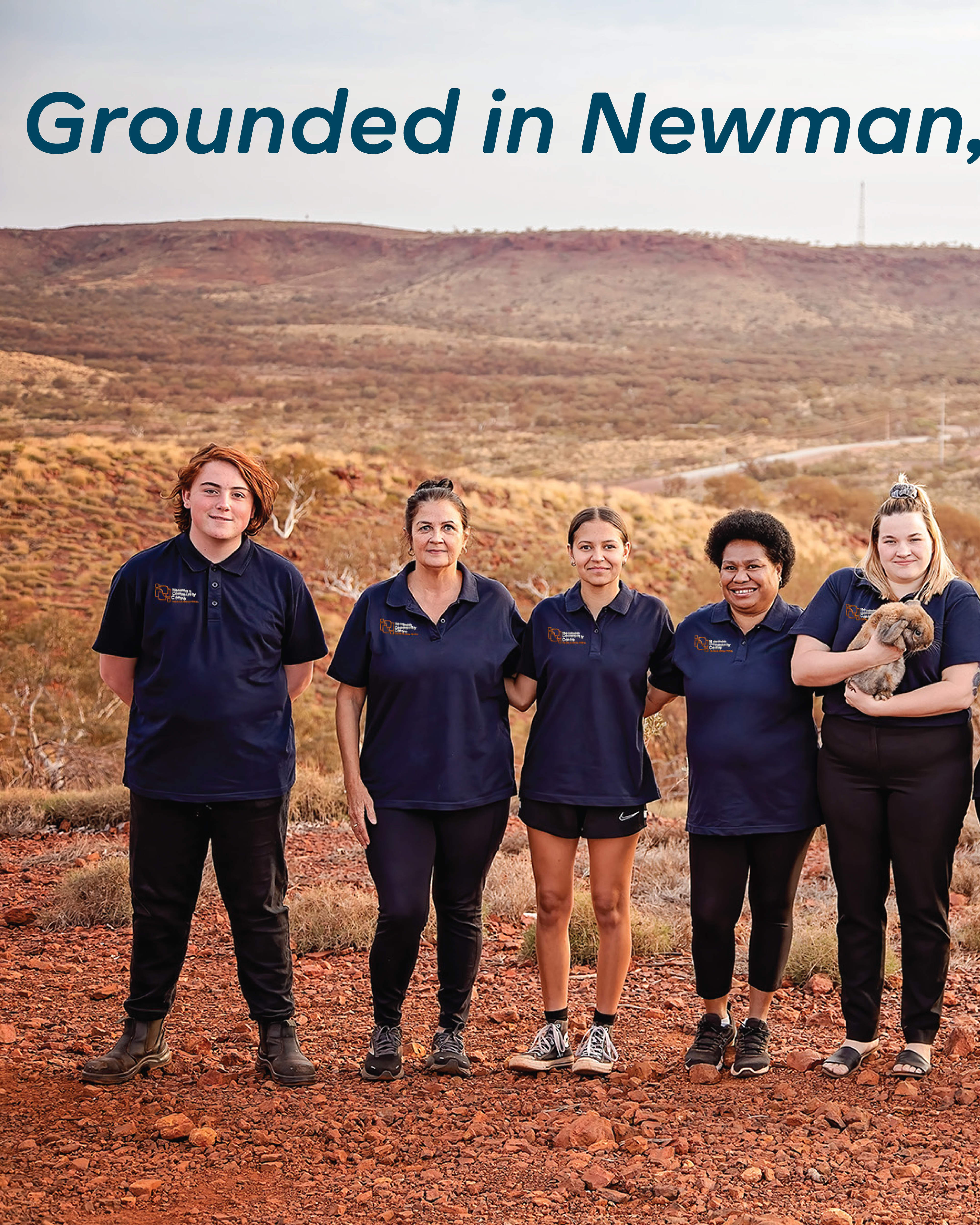
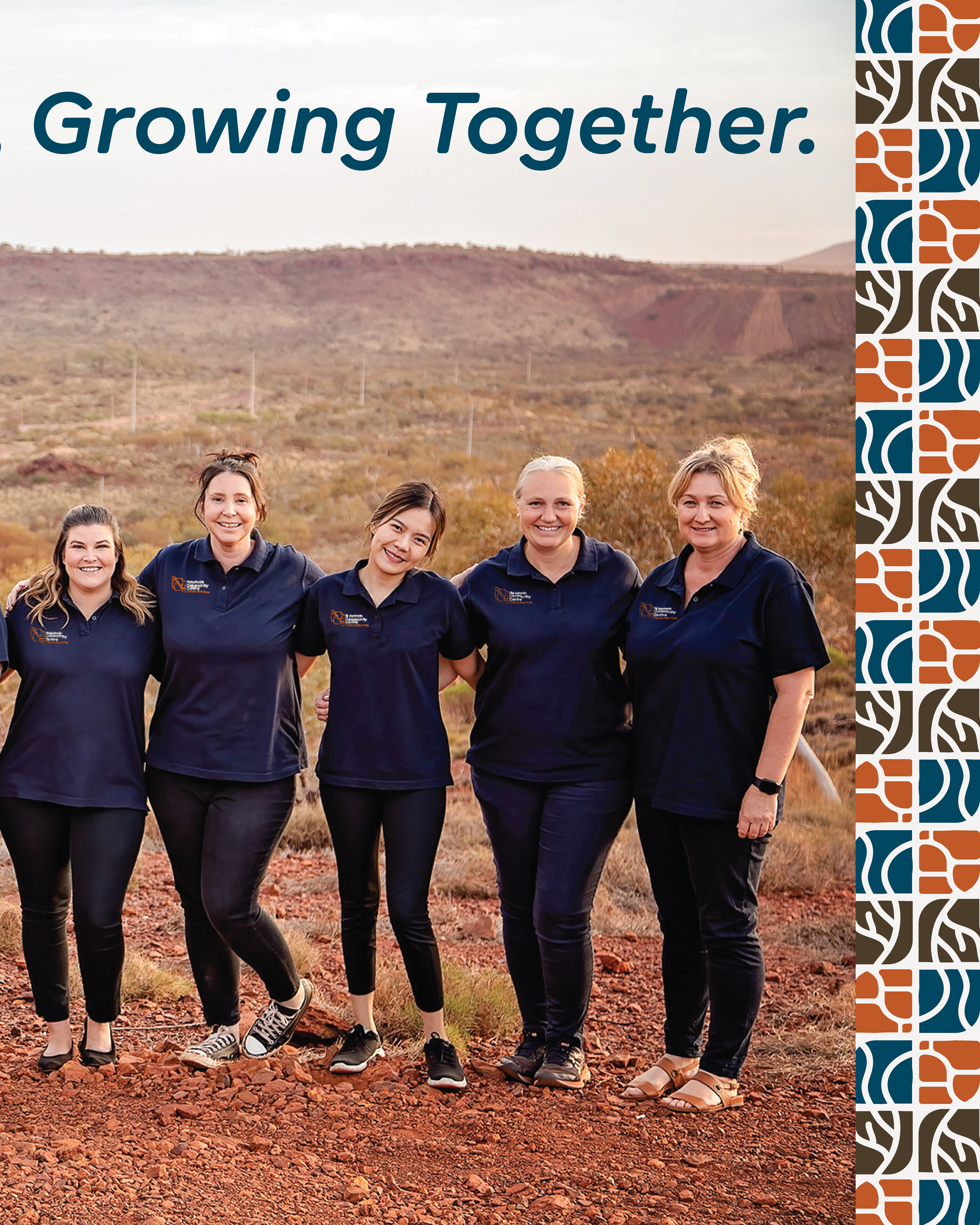
For 30 years, the Newman Community Centre (formerly the Newman Neighbourhood Centre) has been a vital lifeline for the people of Newman, Western Australia. Born from the desire of the wives of mine workers to create a space for connection and creativity, it has since blossomed into a dynamic hub offering services that go far beyond its original mission. The centre is now a foundational part of the community, providing essential health services, childcare, programs, and events that make Newman a better place to live.
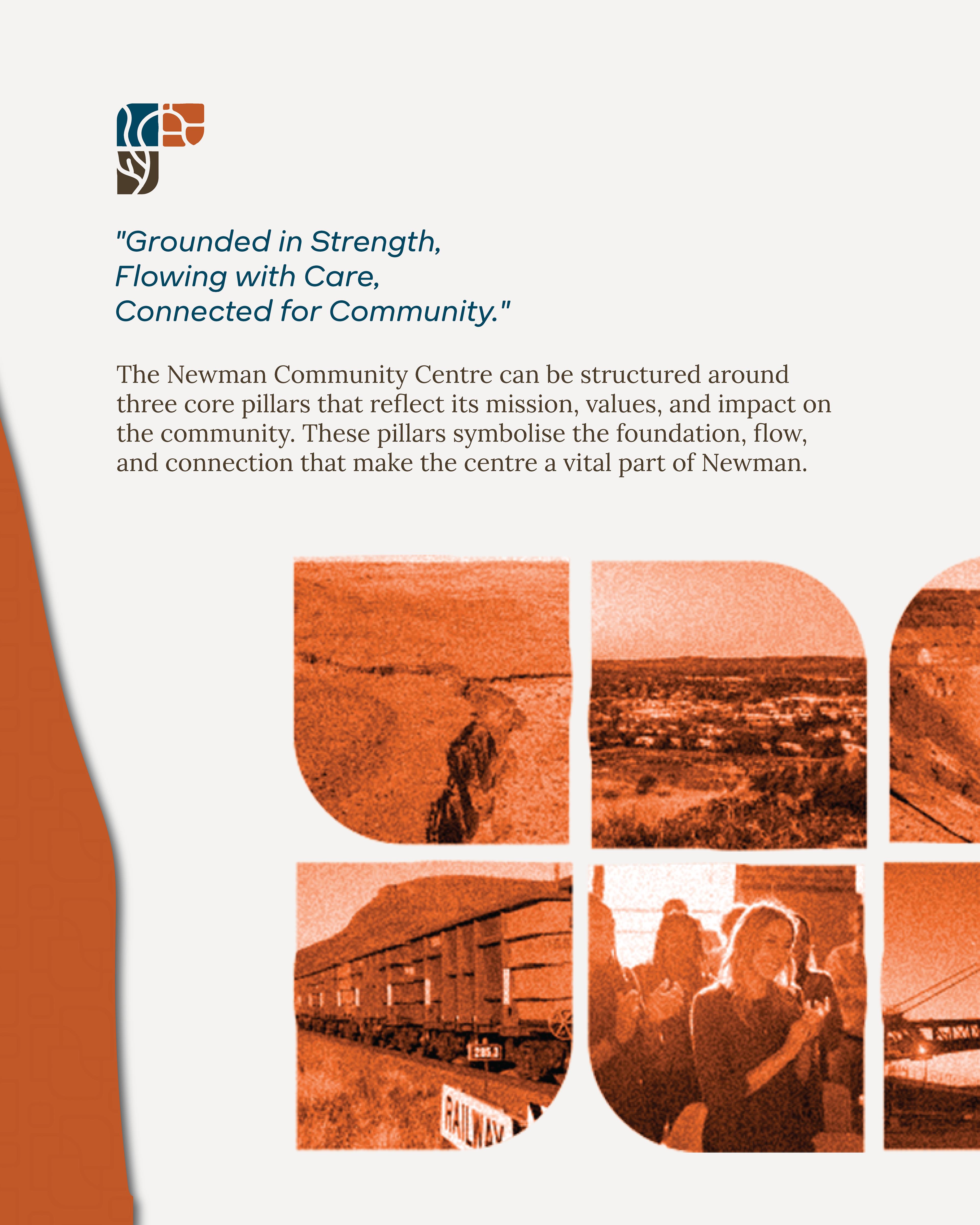
Our Misssion is Simple; To foster a strong, vibrant, and connected community. The Newman Community Centre stands as a pillar of support in our town, welcoming all members of the community—from parents and children to seniors and workers. We believe in creating a place where people feel supported, empowered, and part of something bigger than themselves.
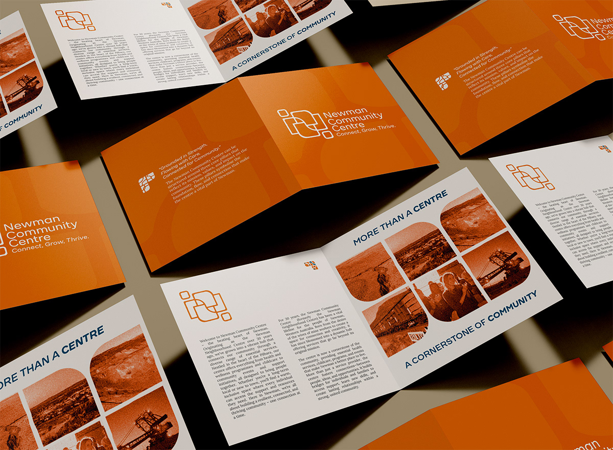
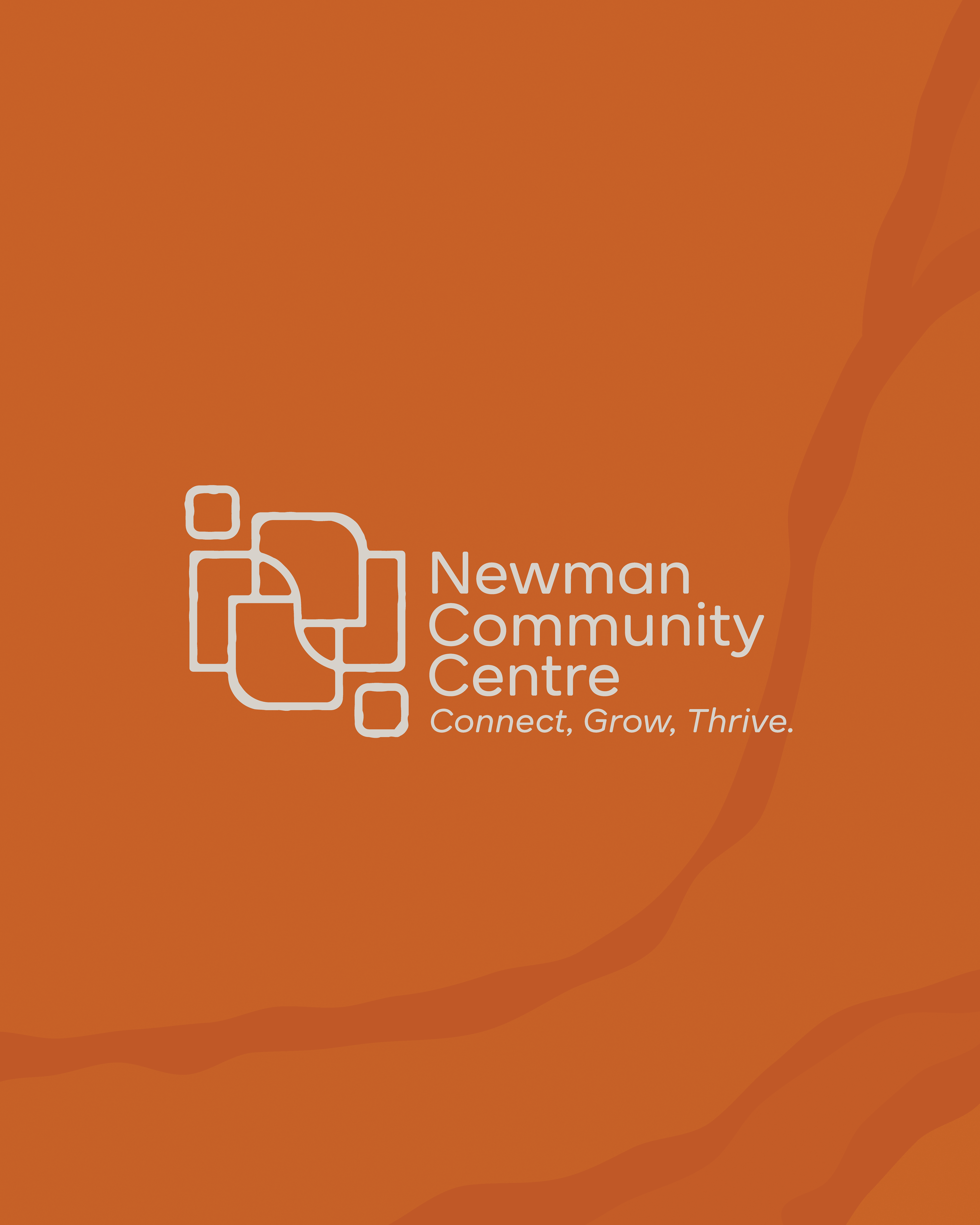
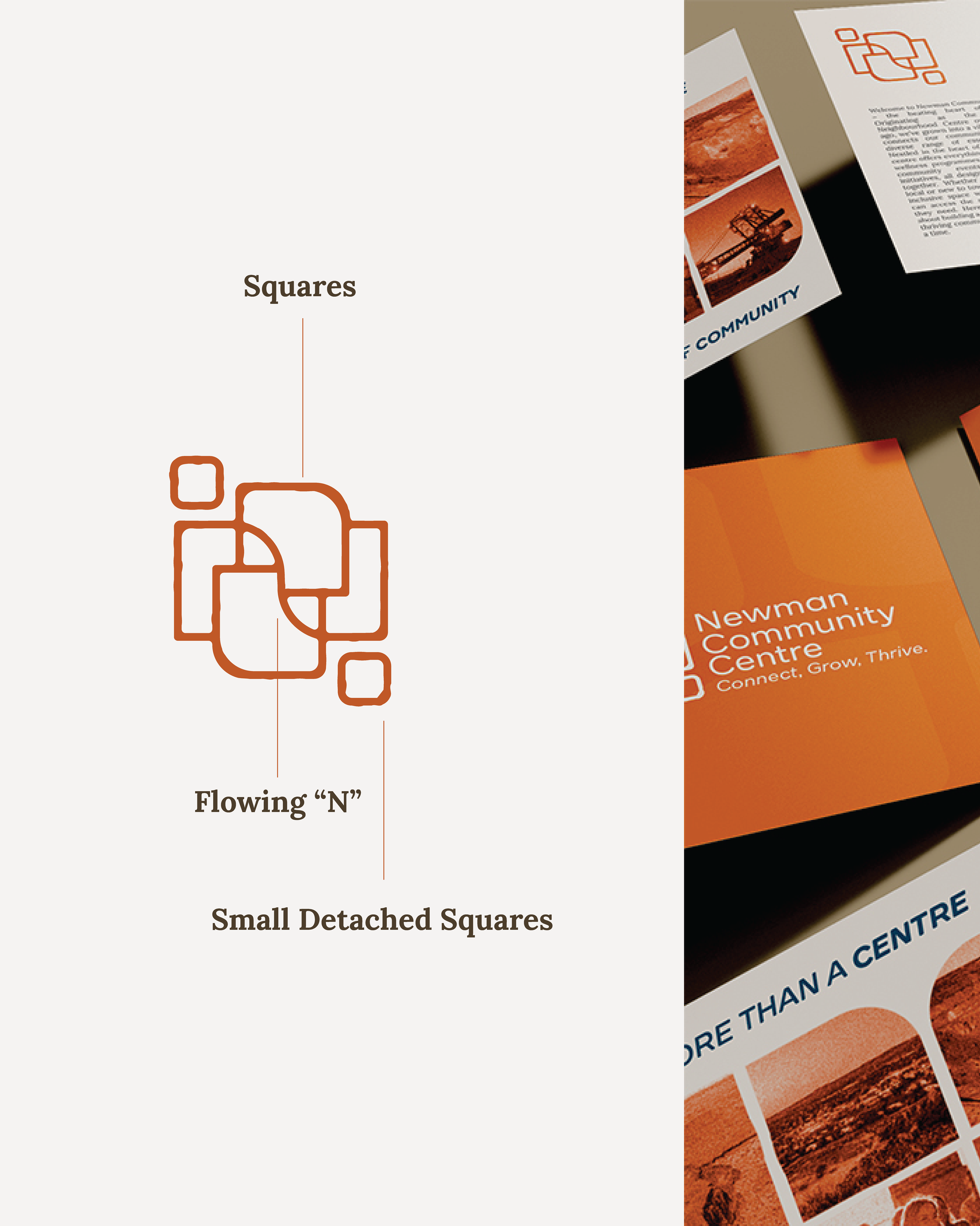
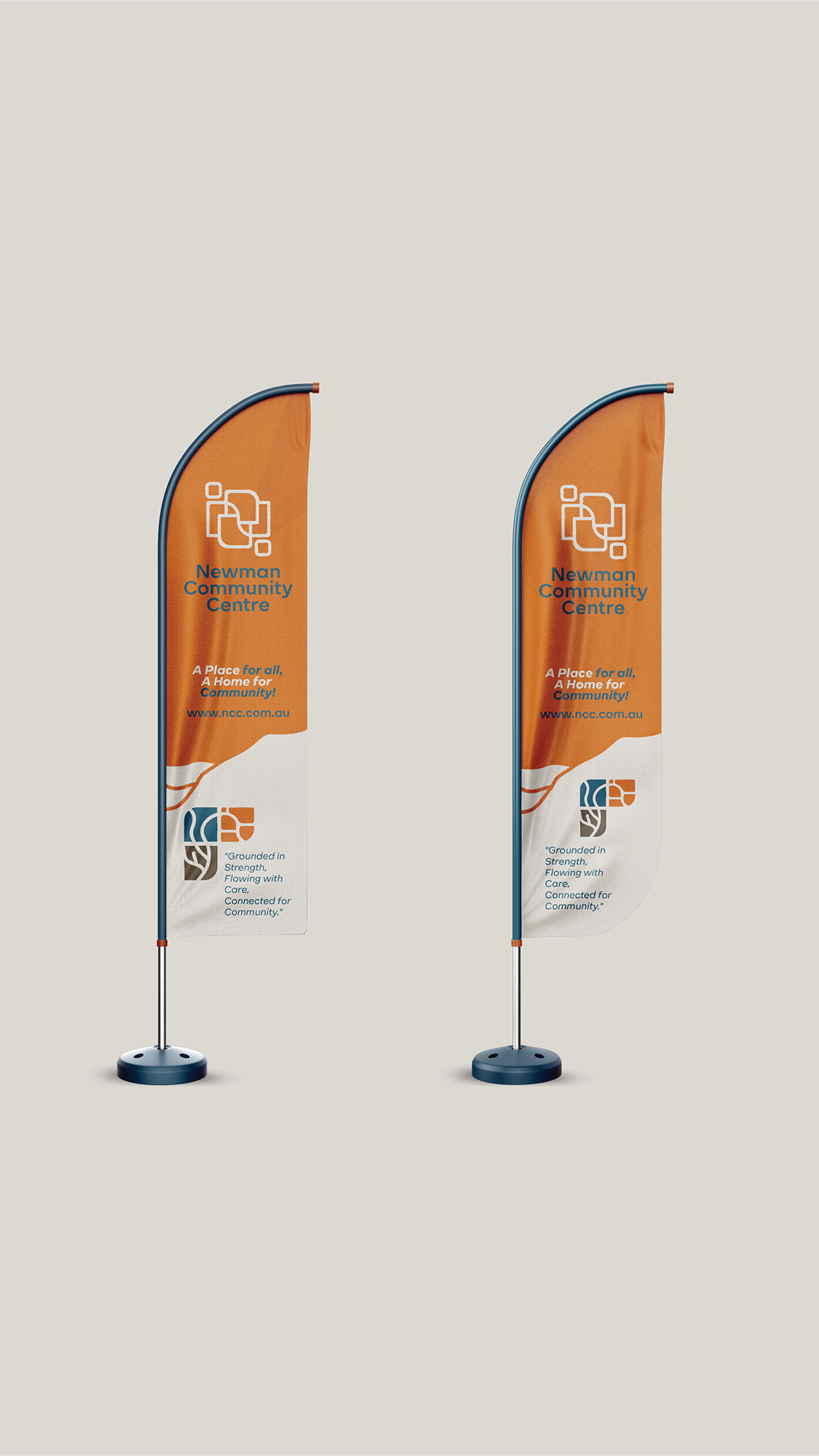
The Newman Community Centre’s visual identity is built on the interplay of structured rectangles and a flowing “N,” creating a design that reflects both stability and connection—core to the centre’s role in an isolated region.
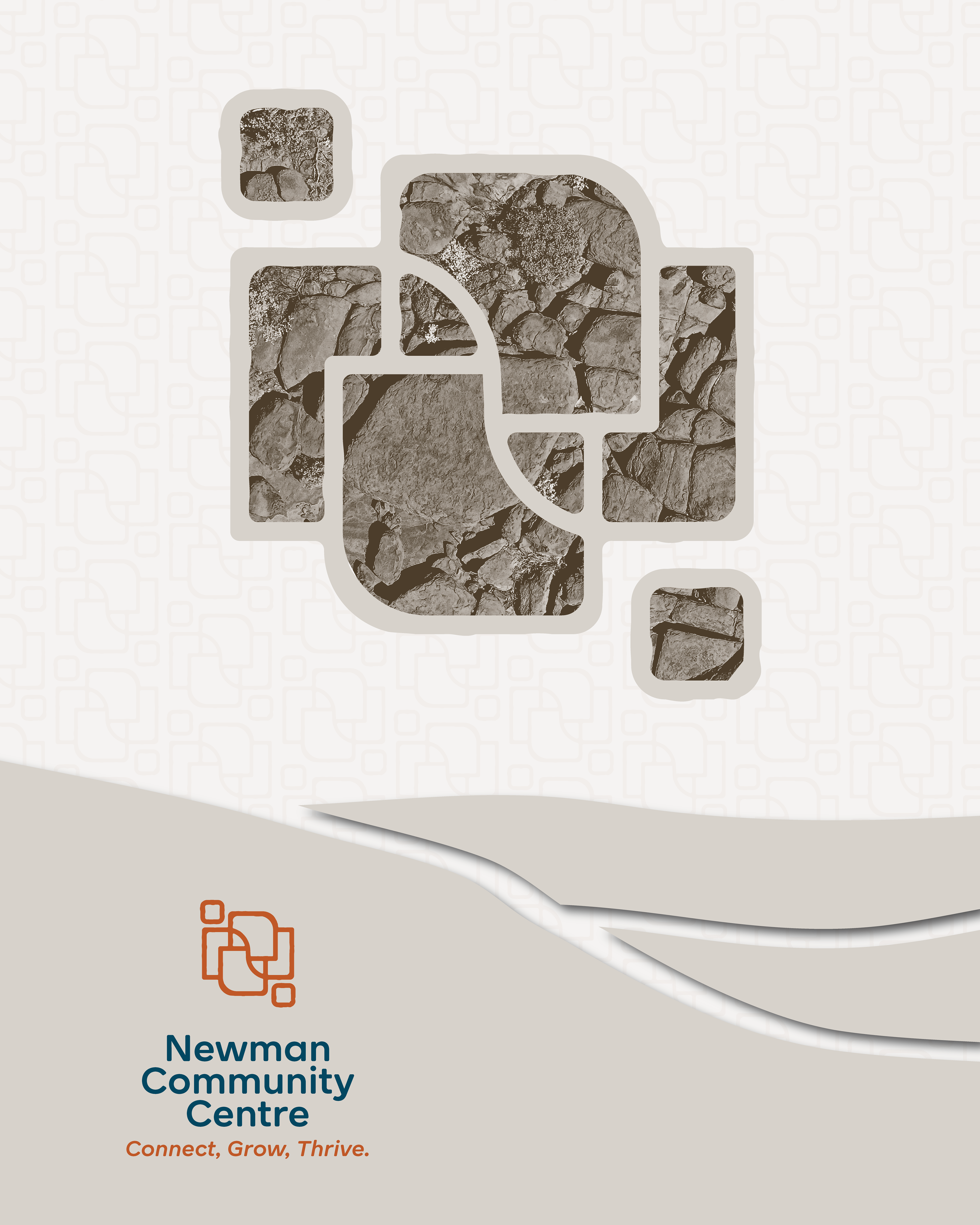
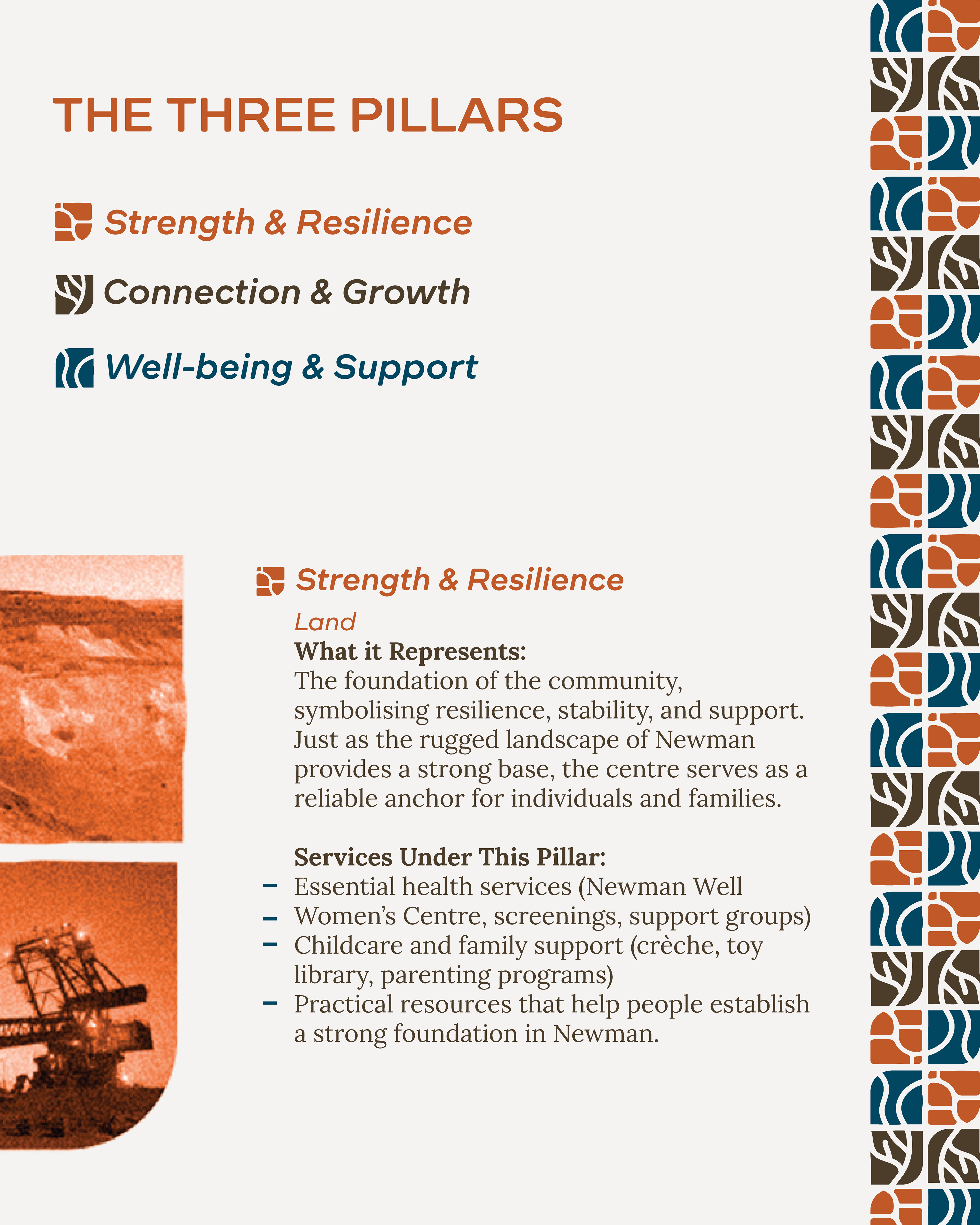
Symbolism & Meaning Squares: Represent stability, organisation, and structure, symbolising the diverse services and resources the centre provides. They also reflect a strong foundation within the community. Flowing “N” (River Symbolism): Represents connection, adaptability, and life—a metaphor for how the centre unites people, nurtures growth, and supports those navigating life’s challenges.
Like a river sustaining life in a remote landscape, the centre is a lifeline for Newman. Small Detached Squares: Symbolise people linking arms, visually reinforcing the idea of human connection and the relationships built within the community. These elements add warmth and inclusivity to the structured design.
Contrast Between Structure & Flow: The geometric rectangles paired with the fluid “N” create a balance between order and movement, reflecting both the dependability of the centre and its ability to evolve with the community’s needs. Rough Edges & Organic Forms: Inspired by Newman’s rugged landscape and resilient spirit, the design’s intentional imperfections reflect the town’s raw, real, and unpolished nature. This authenticity ensures the brand identity remains deeply connected to its surroundings.
This identity captures the essence of the Newman Community Centre—structured yet welcoming, dependable yet adaptable, and above all, a place where people come together.
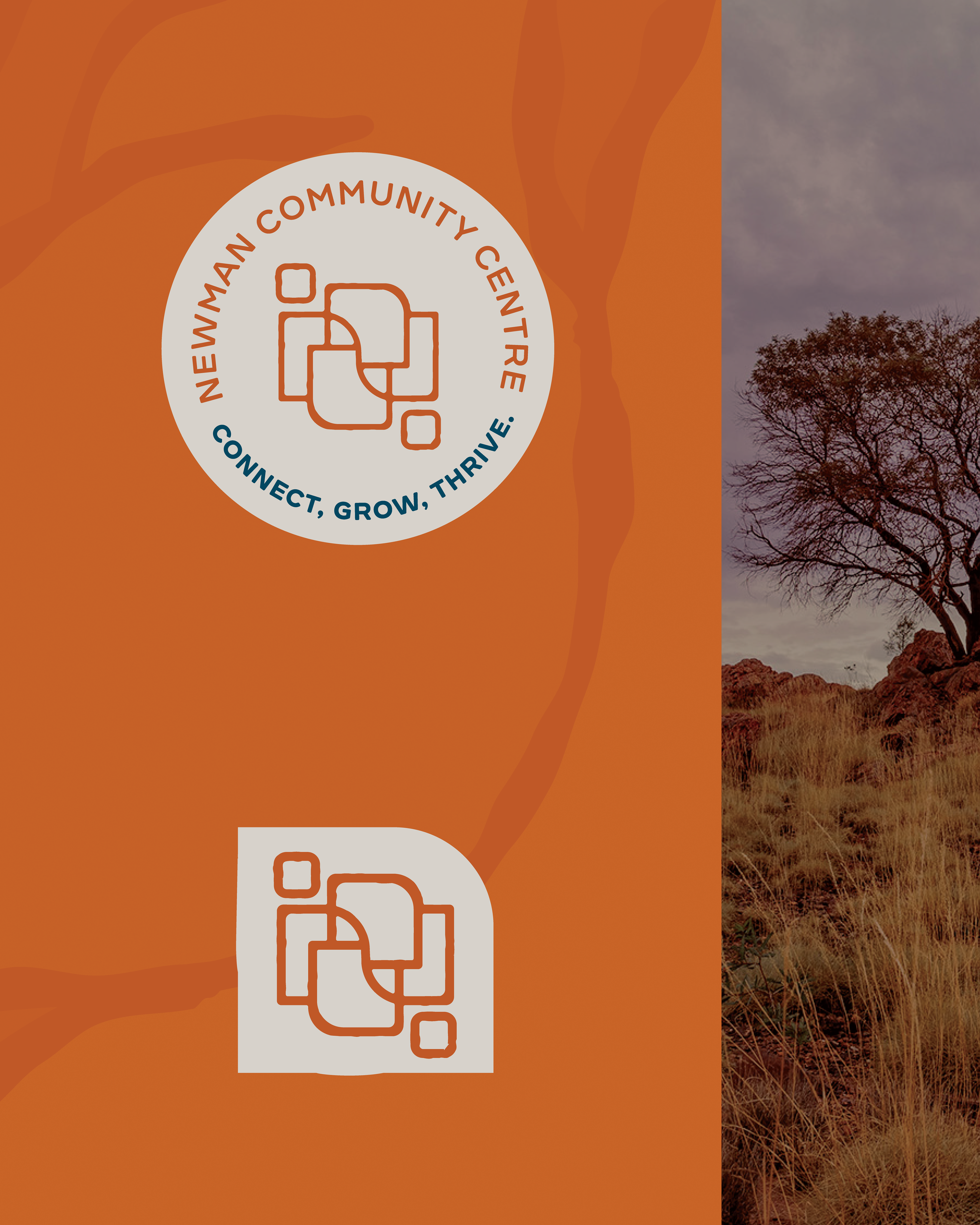
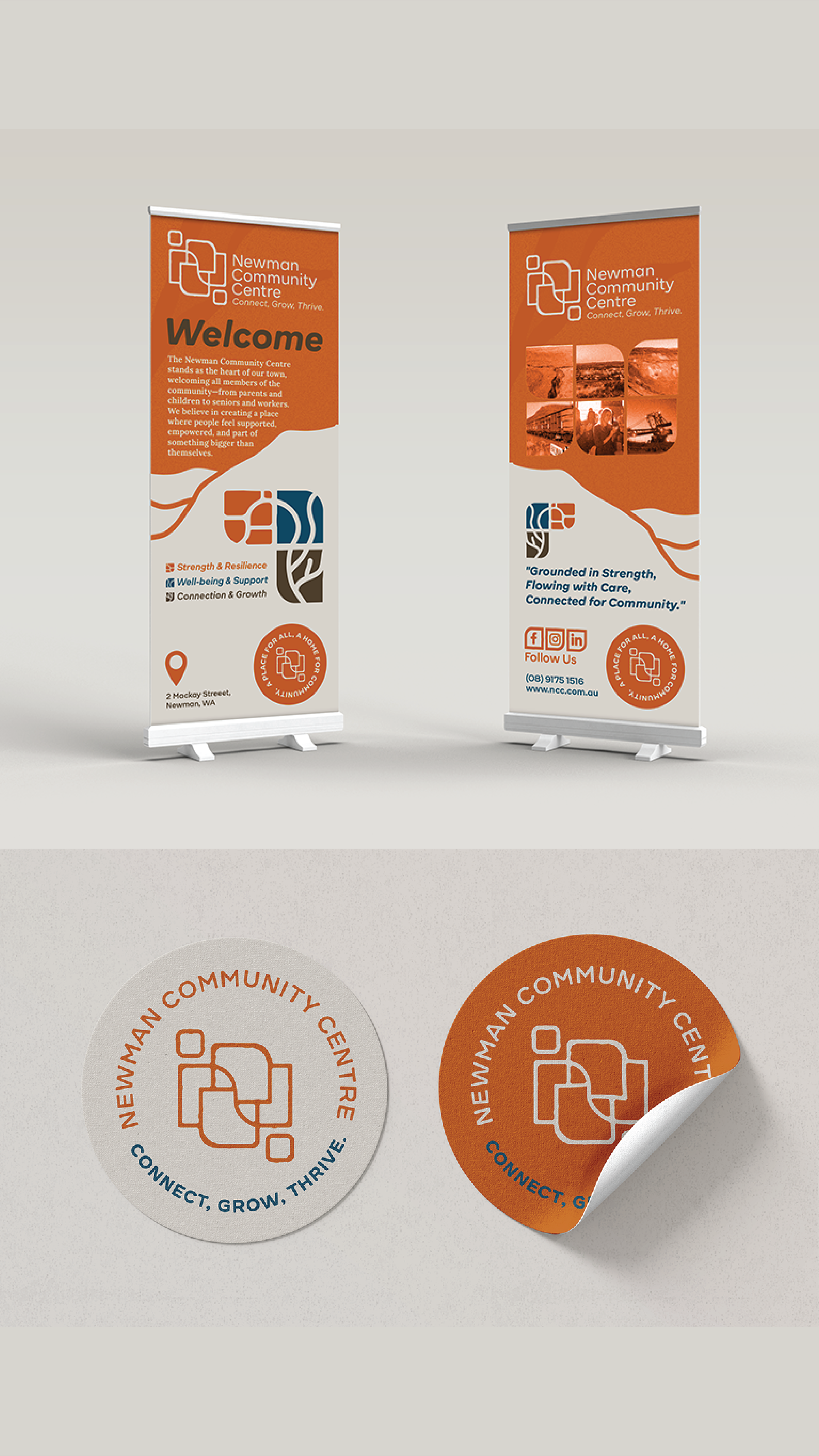
The primary logo of Newman Community Centre embodies the essence of connection, growth, and community. The logo's design features interconnected shapes, symbolising unity and collaboration, which are at the core of the Centre's mission. The use of warm, earthy tones reflects strength and stability, while the clean, modern typography conveys a sense of trust and professionalism.
This logo is a bold representation of the Centre’s commitment to creating a nurturing environment where individuals and communities can come together, grow, and thrive. It is designed to be instantly recognisable, making a strong visual impact across all brand touchpoints.
Tone of Voice
At Newman Community Centre, we are committed to creating a space where everyone can connect, grow, and thrive. Our mission is to provide a supportive, inclusive environment where individuals of all backgrounds come together to build lasting relationships, develop their skills, and foster a sense of community.
Through our programs and services, we help people not only overcome challenges but also grow stronger through connection and collaboration. We believe that when individuals are empowered, supported, and connected, they can achieve their fullest potential. Whether you are seeking personal growth, wellness, or community support, the Newman Community Centre is here to guide you every step of the way.
Empowering & Supportive We speak with compassion and positivity, encouraging everyone to reach their full potential. Our messaging is designed to uplift and motivate, always offering support and guidance along the journey to personal and communal growth.
Inclusive & Welcoming Our voice is inclusive and approachable, ensuring that every individual feels like they belong. We are committed to creating a safe and welcoming space for all, where diversity is celebrated, and everyone has a seat at the table.
Warm & Relational We communicate with warmth and care, focusing on building meaningful relationships within our community. Our tone reflects our genuine commitment to the well-being and success of each individual we serve.
Collaborative & Community-Focused At the heart of our message is collaboration. We speak as partners in growth, focused on building strong, resilient communities where everyone can thrive together.
Trustworthy & Inspiring We communicate with transparency and integrity, fostering trust with our community members. Our words inspire confidence in the future, motivating others to take action towards their personal growth and the betterment of the collective.

A rebrand with heart—for a centre that truly deserves it.
What a deep, and meaningful journey this project was. The Newman Community Centre rebrand was exactly that—in the best possible way. It pushed me creatively, made me pause, reflect, and dig deeper… and the results speaks for itself.
My concept (not quite executed) sat with me for a couple of weeks, quietly brewing, because I hadn’t quite felt that fire in my belly—the moment I know we’ve nailed it. And I don’t stop until I feel it. When it finally landed, everything fell into place and a brand with real meaning, soul and purpose was born.
Working with Peta and the amazing team has been such a pleasure. Their 30-year celebration aligned perfectly with the rebrand, and it was incredibly special to see the new identity embraced with so much excitement and pride.
I’m so thankful to have been chosen to bring this rebrand to life, and I can’t wait to see what’s next for the centre as it steps confidently into this next chapter.