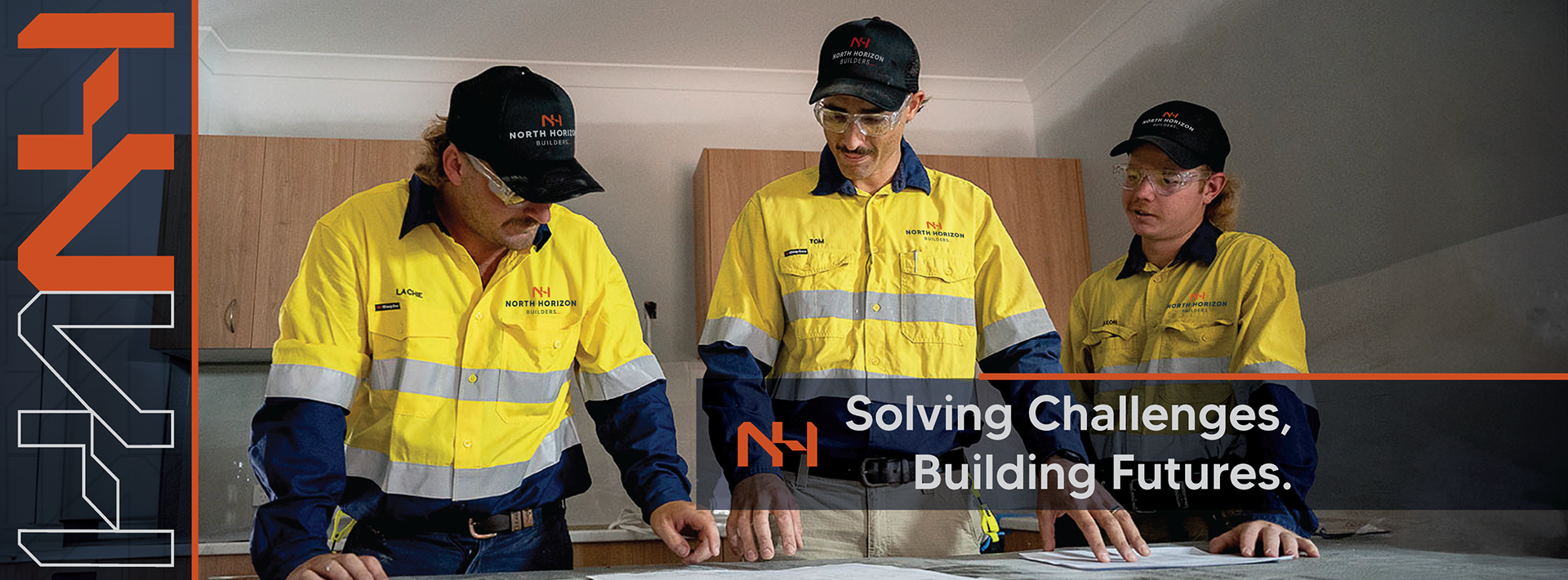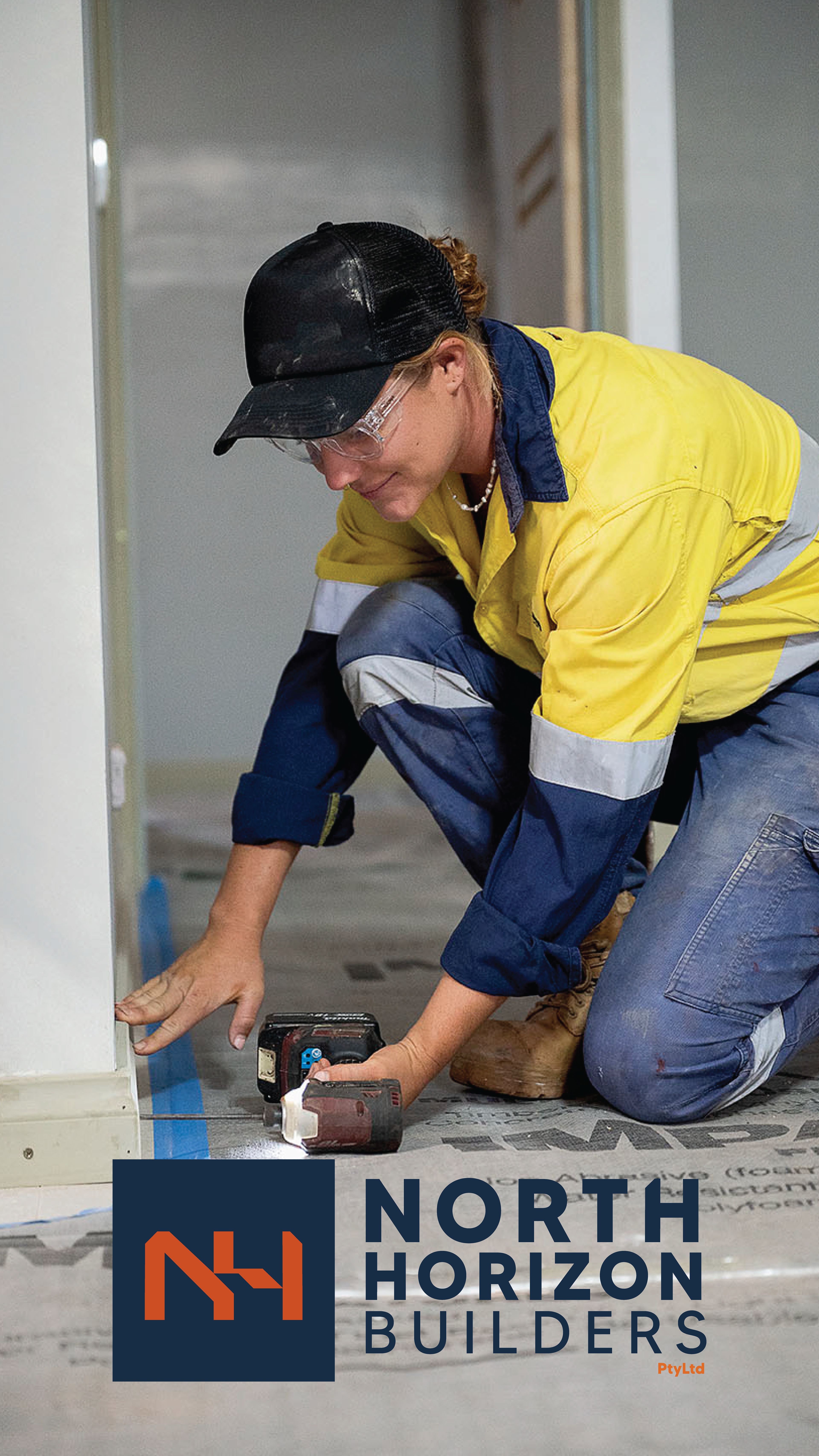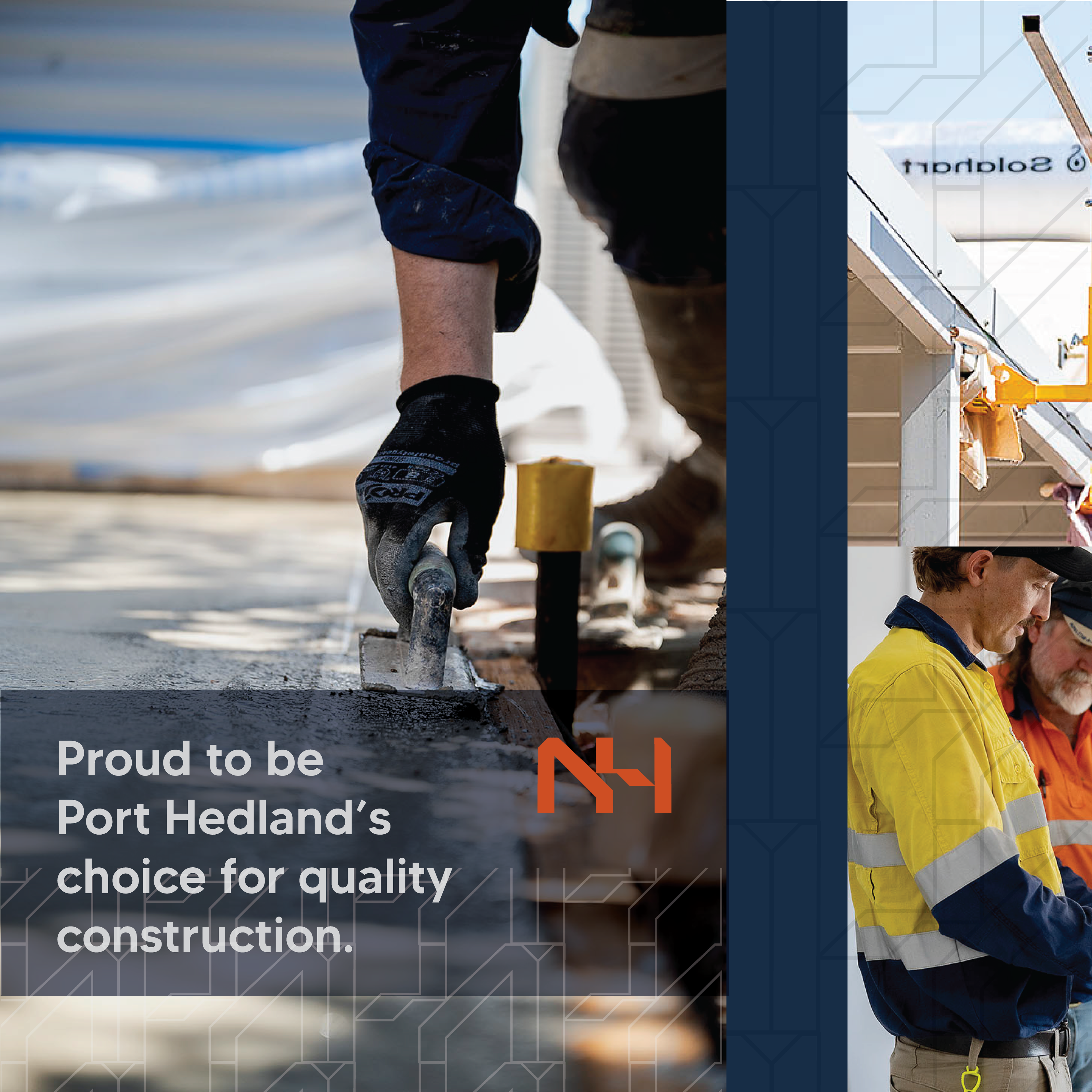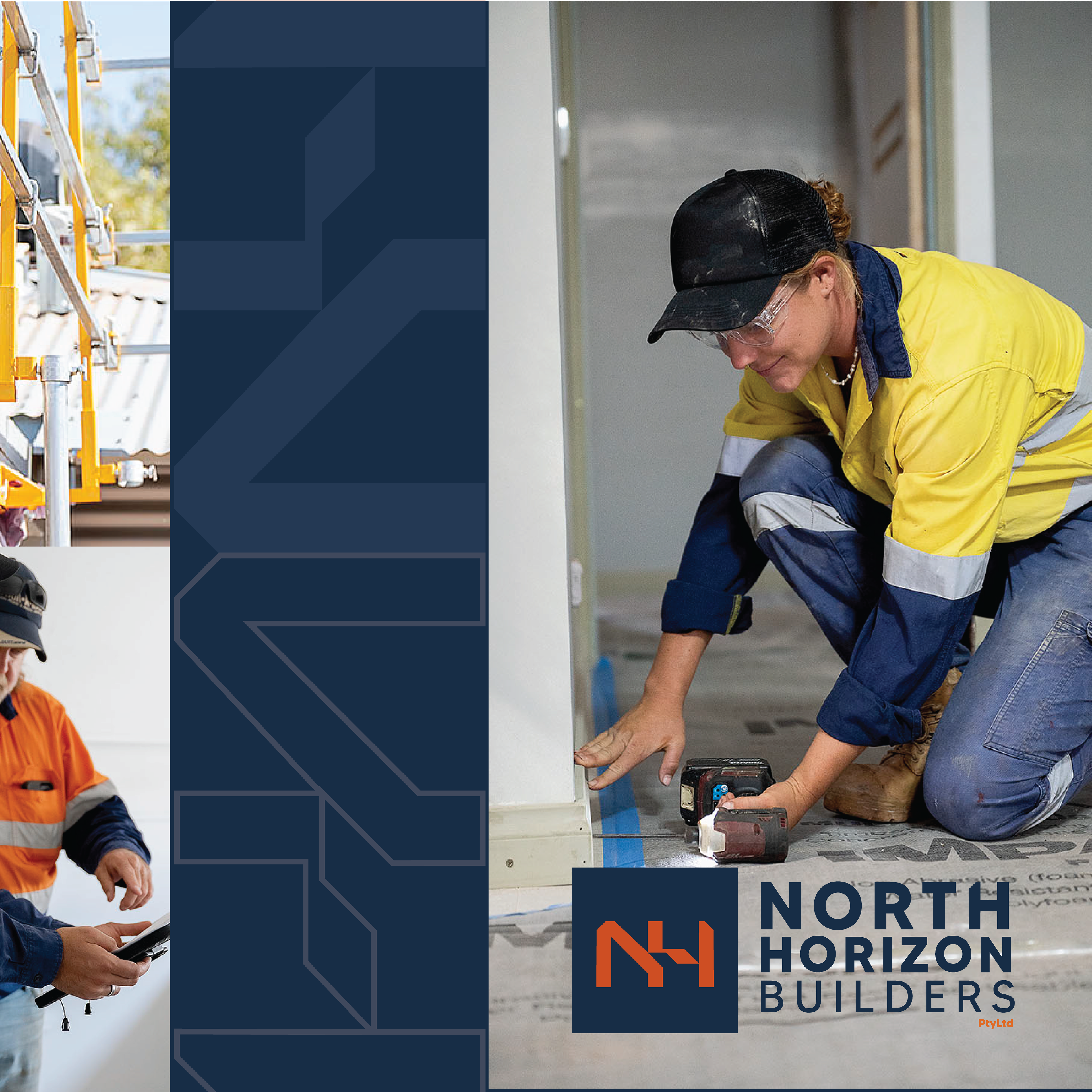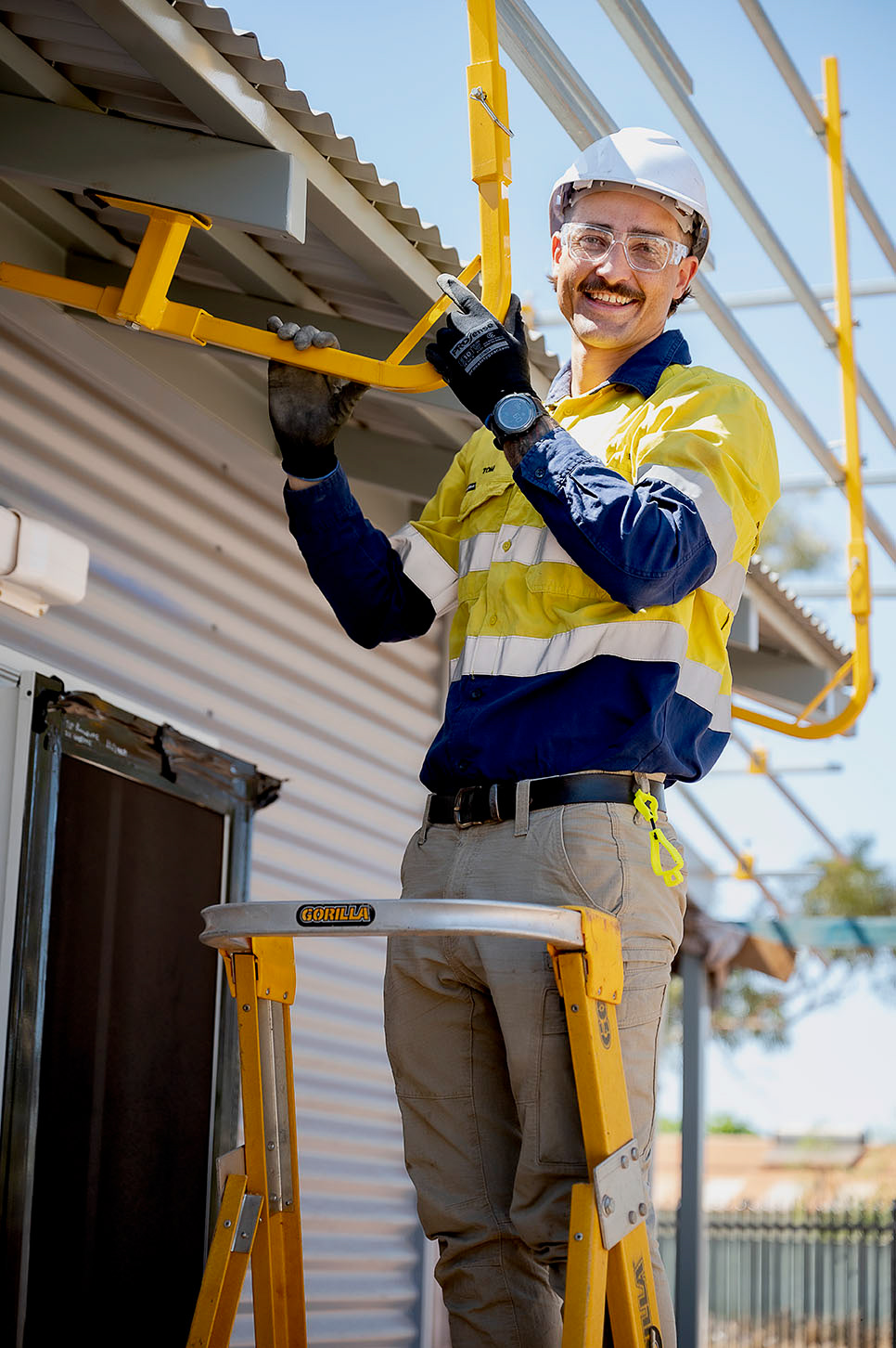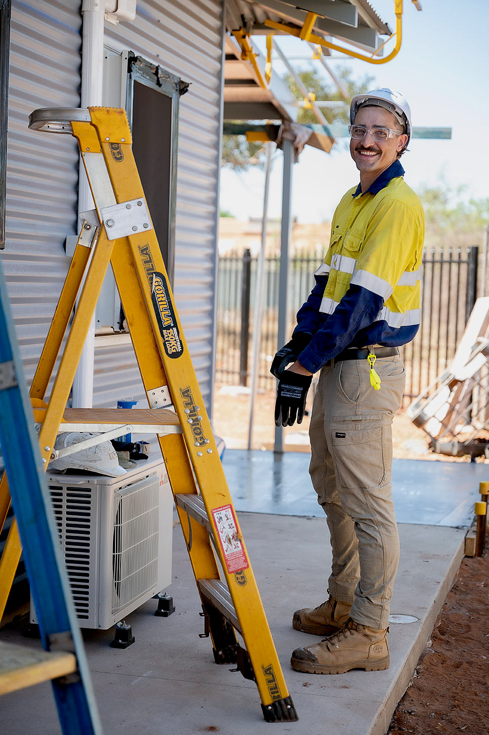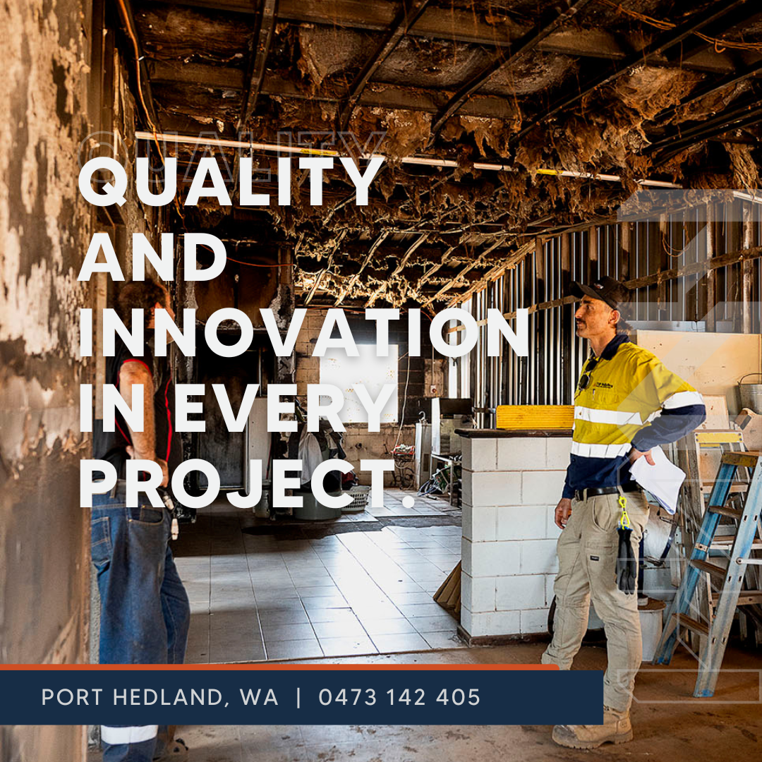
Project - Company Restructure & Re-Brand, including Brand Photography.
North Horizon Builders (formerly TSP Building Pty Ltd) is well-positioned to tap into a niche in the construction market that combines the versatility and adaptability of a smaller firm with the capability to handle both residential and commercial projects. With a focus on quality, local knowledge, and strong client relationships, North Horizon Builders aims to stand out by providing reliable, high-quality work tailored to the unique needs of the Port Hedland region.
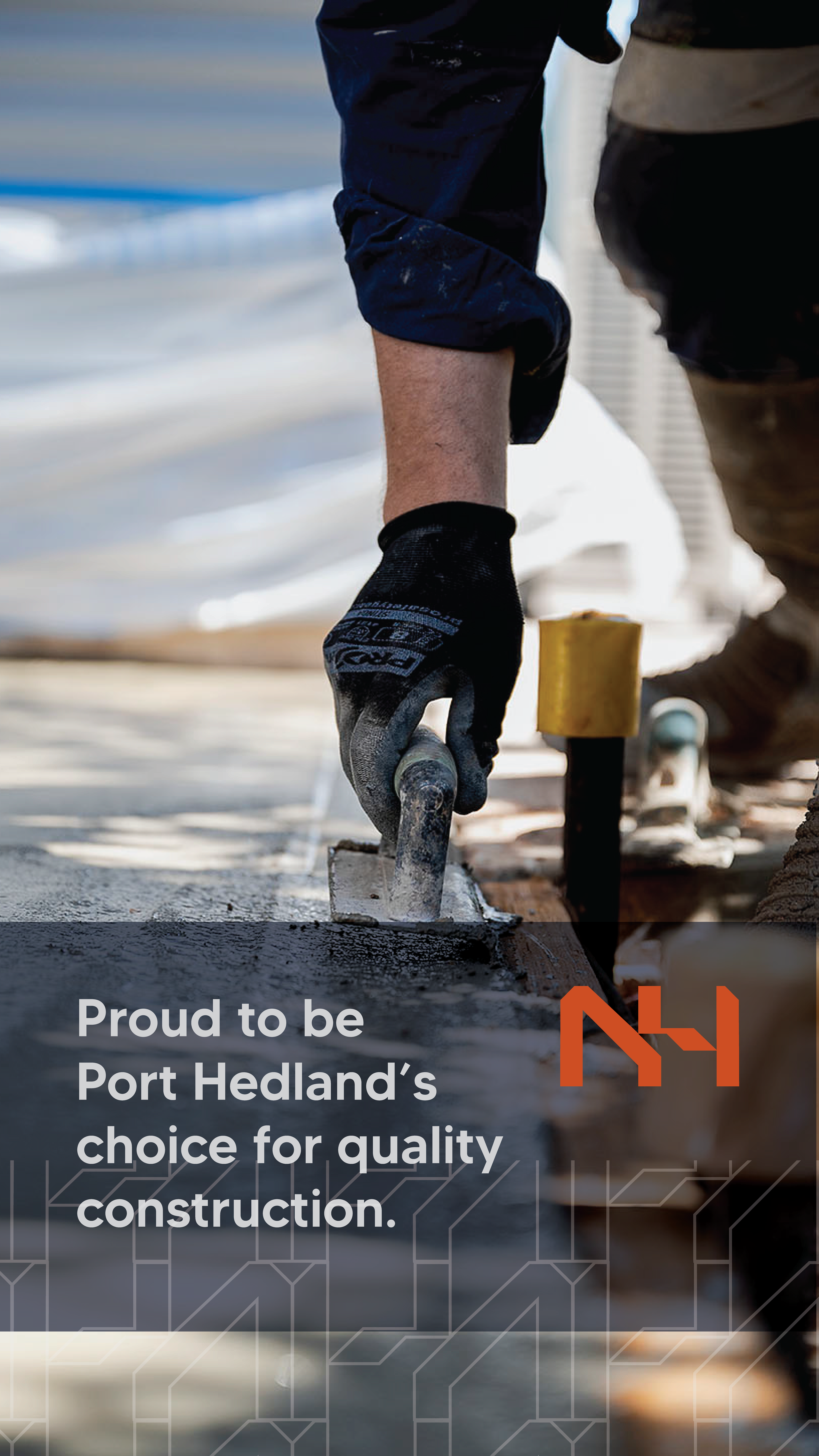
Establish North Horizon Builders as a leading, trusted local company in Port Hedland known for delivering quality residential and commercial construction with a community-focused approach.
Vision: When designing a logo for North Horizon Builders, it's essential to reflect the brand's values of reliability, local expertise, and quality craftsmanship, while also appealing to both commercial clients (like local councils and government entities) and homeowners.
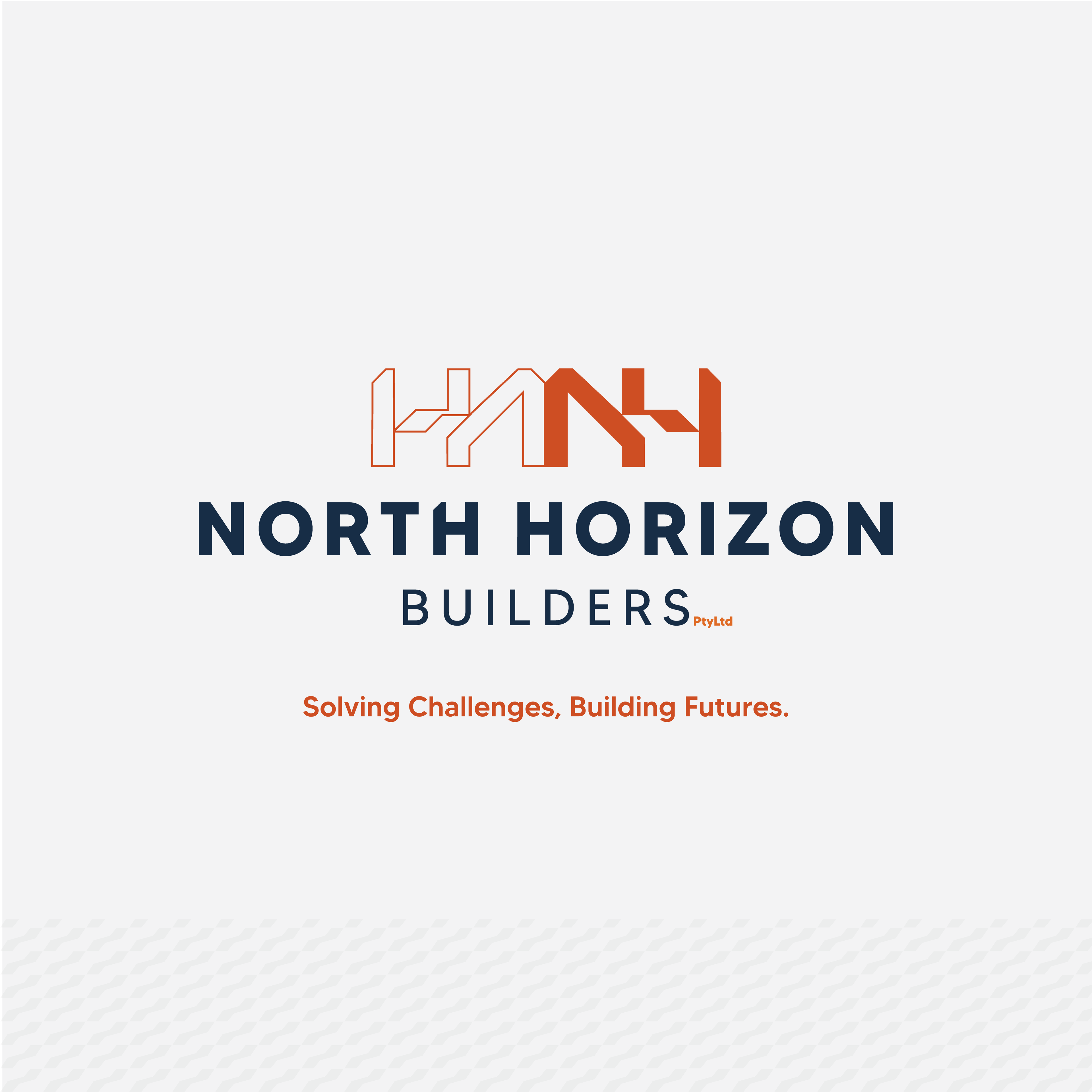
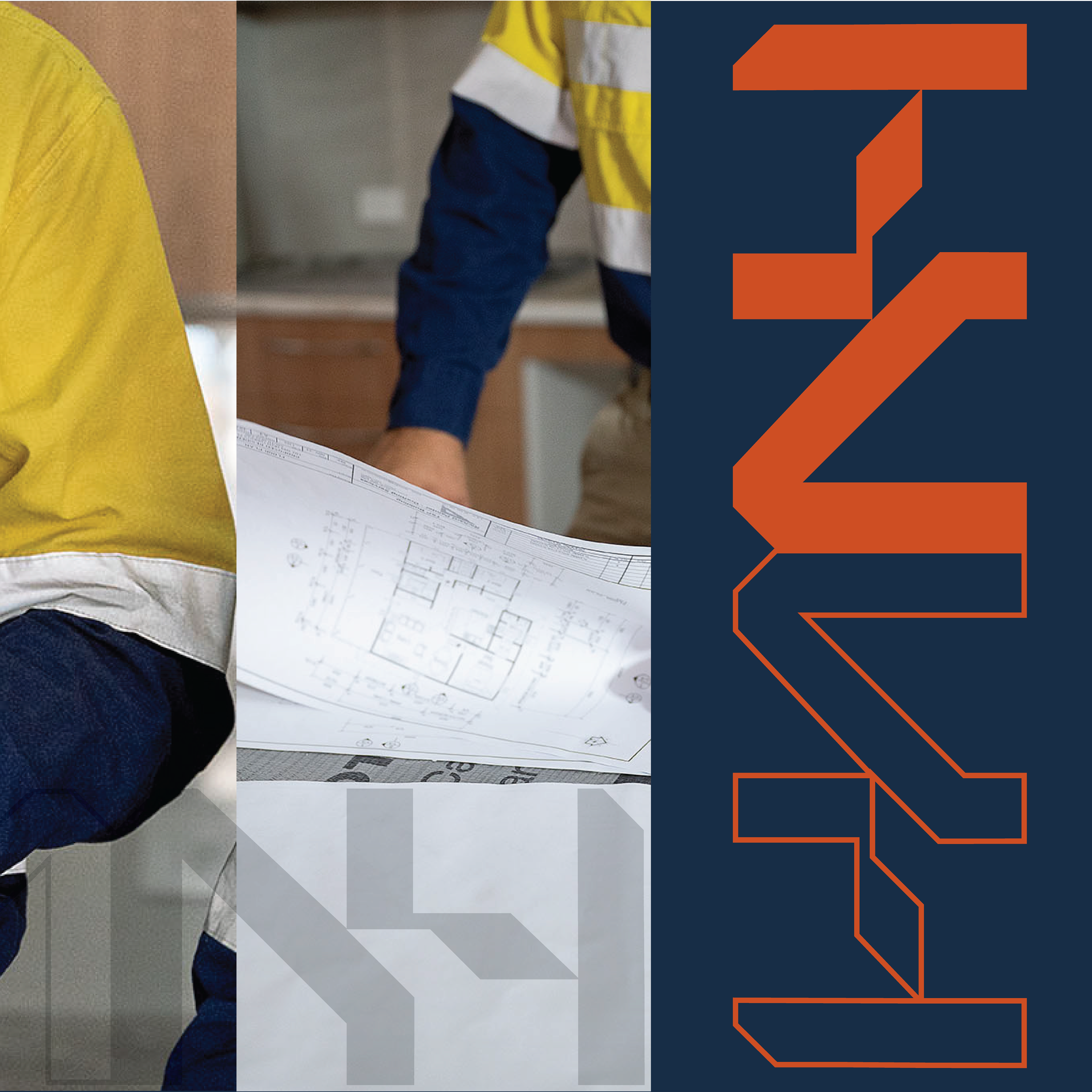
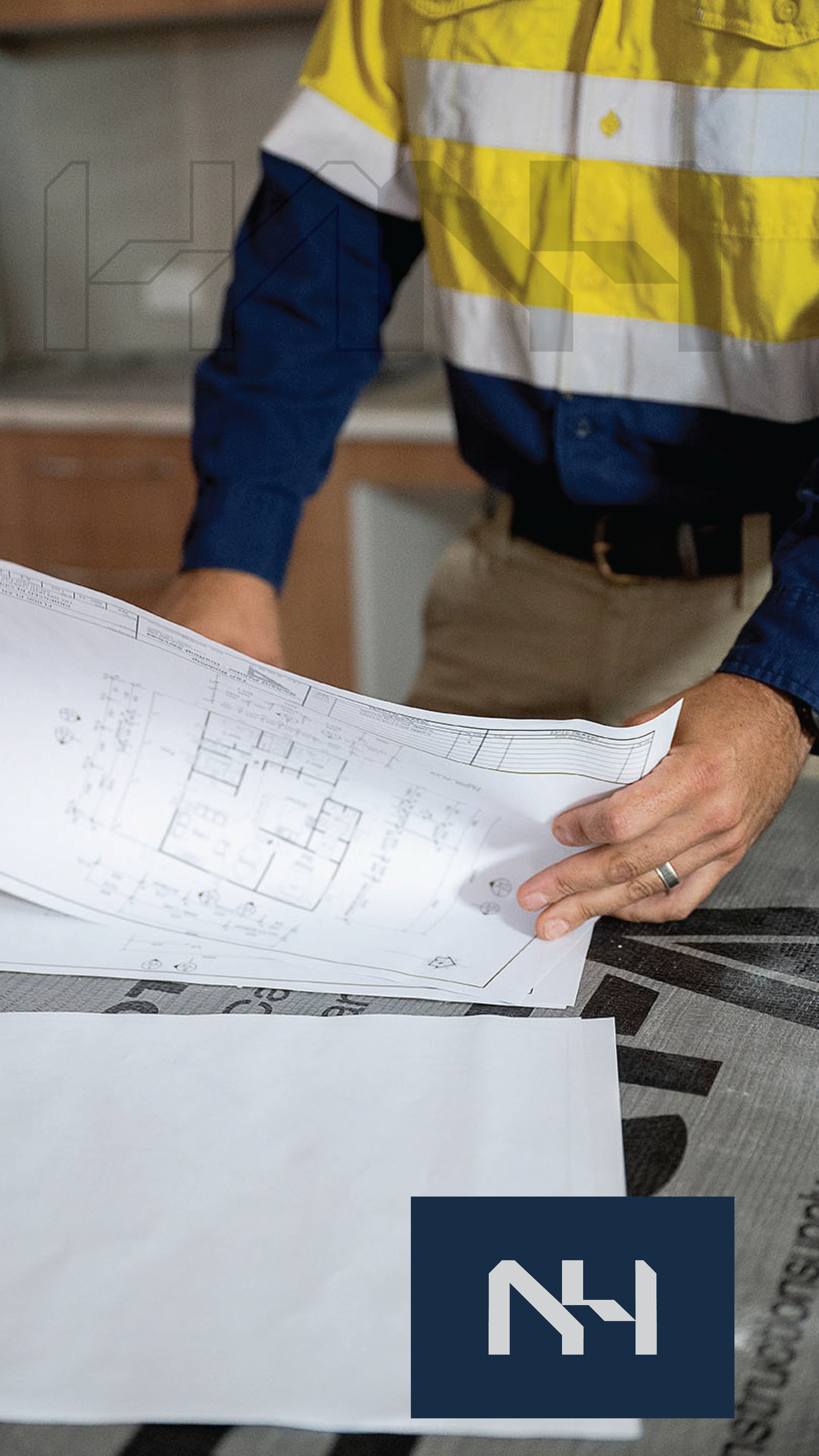
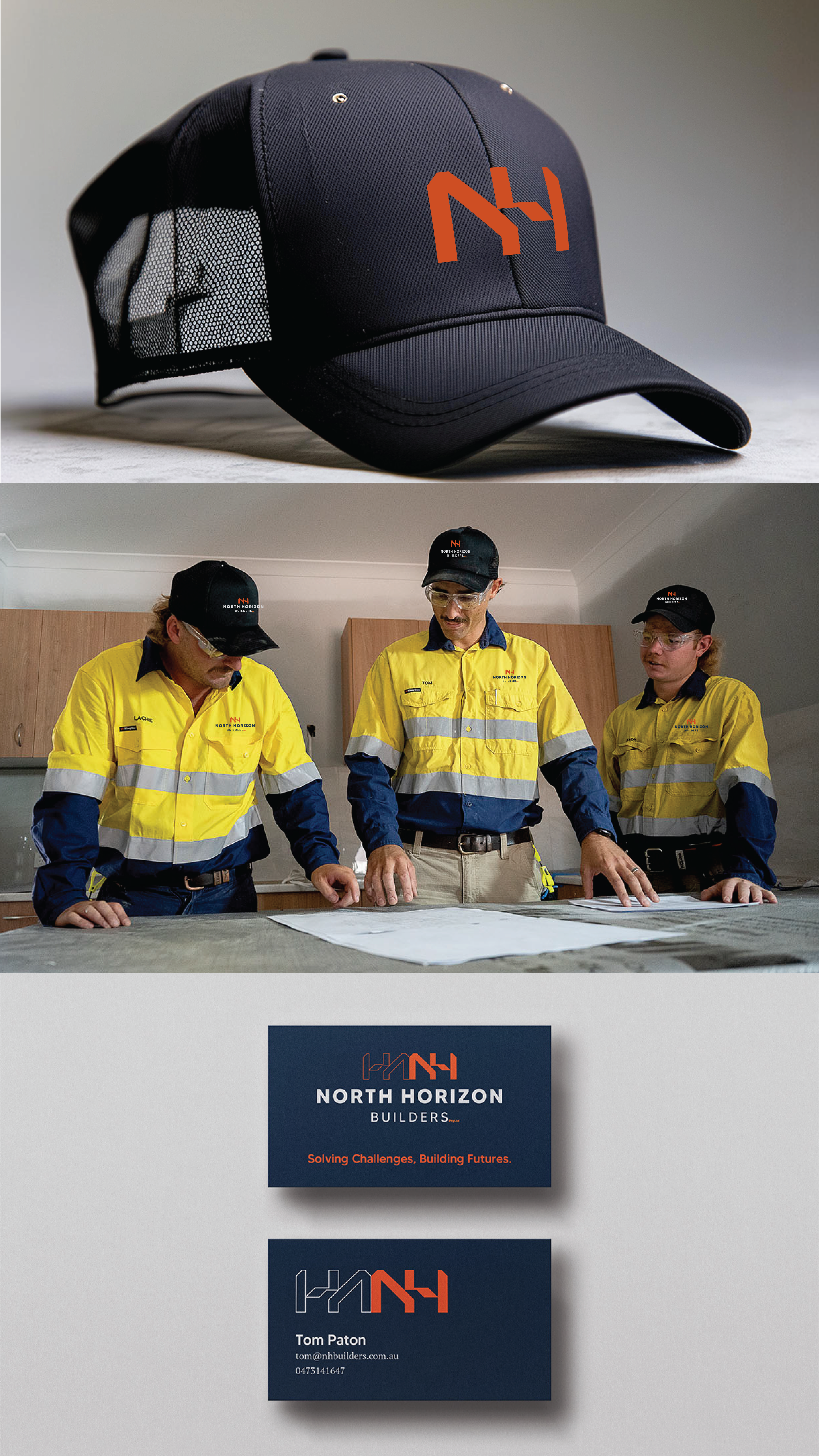
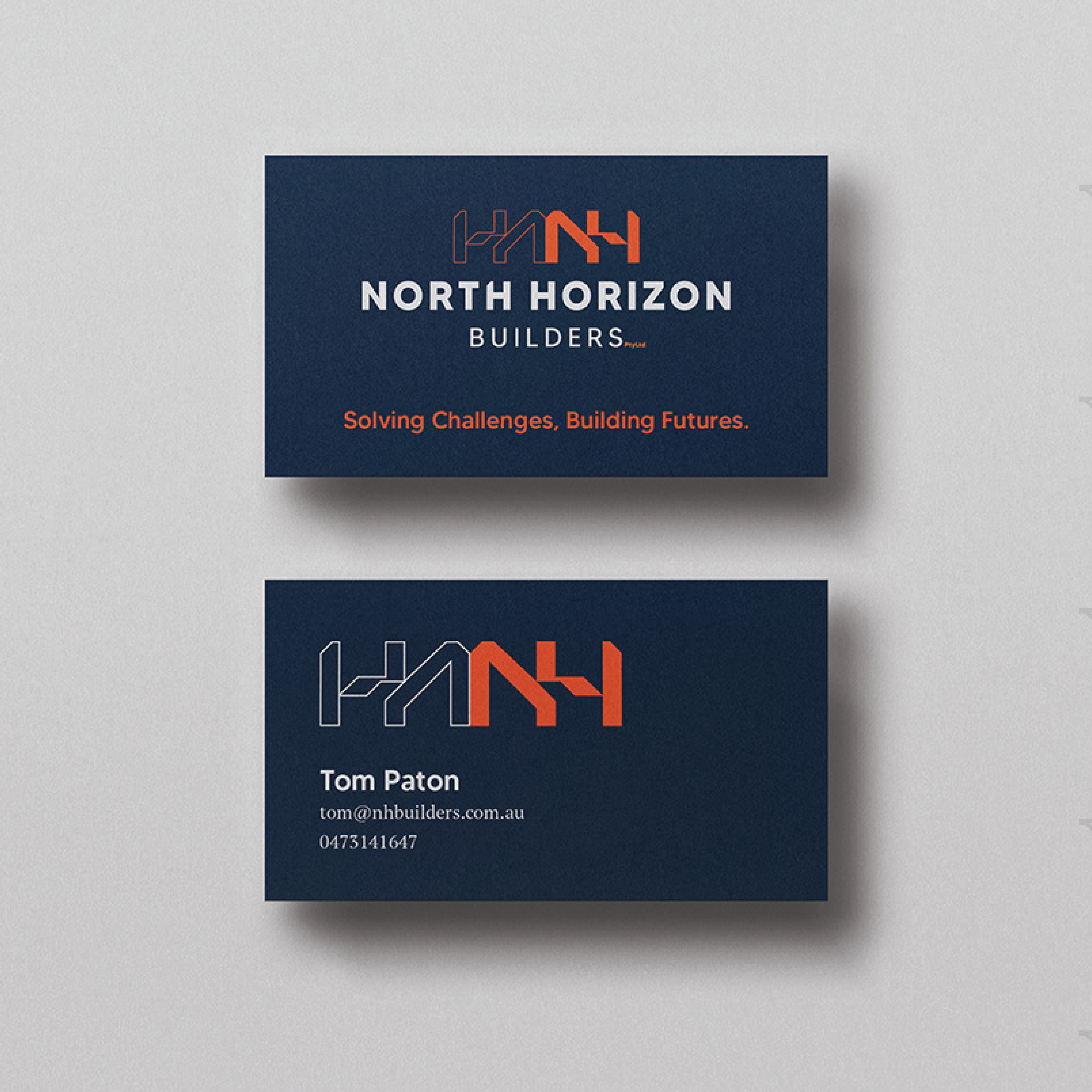
The North Horizon Builders logo is a versatile and symbolic design that reflects the company's journey of transforming visions into reality. It is designed to convey the start-to-finish process of a build, showcasing the transition from conceptual design to a fully realised structure. Dual Representation The logo is presented in two distinct styles: Outlined Monogram: This represents the early stages of a project—the vision, the blueprint, and the architectural drawings. It symbolises the creative and technical planning required to bring ideas to life. Solid Monogram with Vibrant Orange Accents: This embodies the completed structure, showcasing strength, durability, and pride in the final result. The use of orange highlights energy, creativity, and the progressive nature of North Horizon Builders.


The North Horizon Builders logo reflects a clean and modern aesthetic, symbolising the company's professionalism and commitment to excellence. The monogram "NH" serves as the central design element, standing for structure and strength—key values in construction. The illusion of the tilted middle arm of the "H" represents both a rise and a nod to the north, symbolising growth, direction, and aspiration. This thoughtful detail conveys the company's forward-thinking vision and dedication to delivering exceptional results. More than just a visual mark, the logo is a statement of competence and pride in the work that North Horizon Builders performs. It signifies being the first choice for clients while emphasizing the company's unwavering standards of quality and reliability. This logo encapsulates the essence of North Horizon Builders: a brand that is modern, dependable, and proud of its achievements in the industry.